Benefits Open Enrollment
Background
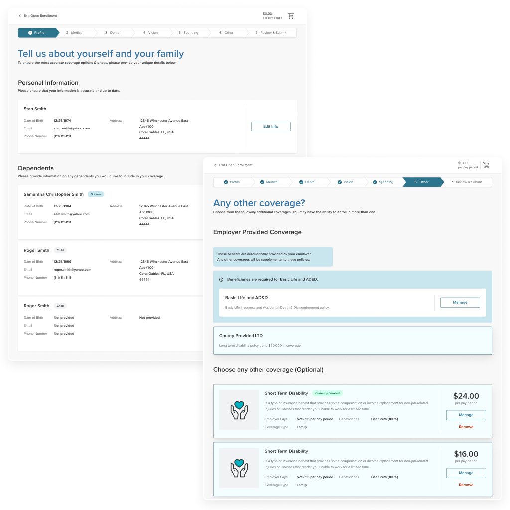
A upgrade and revamp of an existing benefits open enrollment flow, catered for client employees. This project is a small portion of a larger initiative to modernize the Benefits software product with current technologies and UX design.
Tools
Figma, Sketch, Jira, Gainsight
Role
Product Designer – strategy, wireframing, high fidelity assets, analytics
Project Timeframe
4 months
Overview
Project Goals
Upgrading the UX for an employee’s open enrollment is crucial as it enhances user satisfaction, simplifies the complex process of choosing benefits, and ultimately improves the overall efficiency and engagement for employees.
The result is a more streamlined and effective experience for both employees and administrators for choosing benefits
Discovery Process
Processes such as user research, feedback from Project Managers and Implementation Consultants, usability testing, competitive analysis, and prototype was used to help uncover valuable insights and data on how to approach upgrading the user experience of Open Enrollment.
Iteration & Innovation
Existing constraints and information architecture
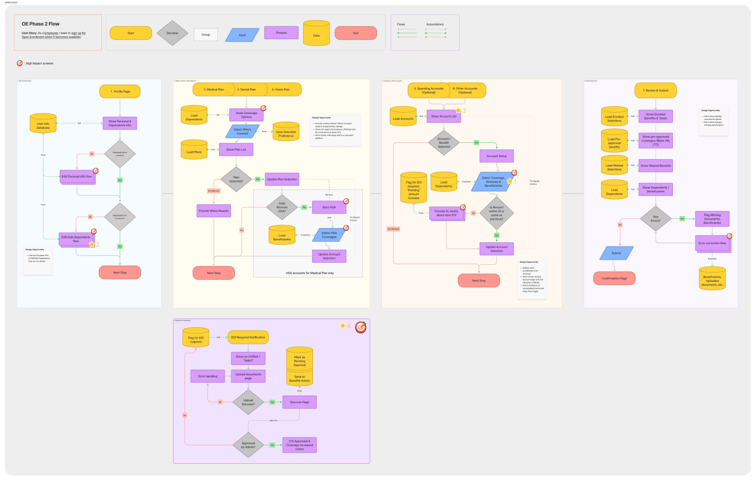
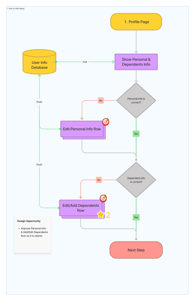
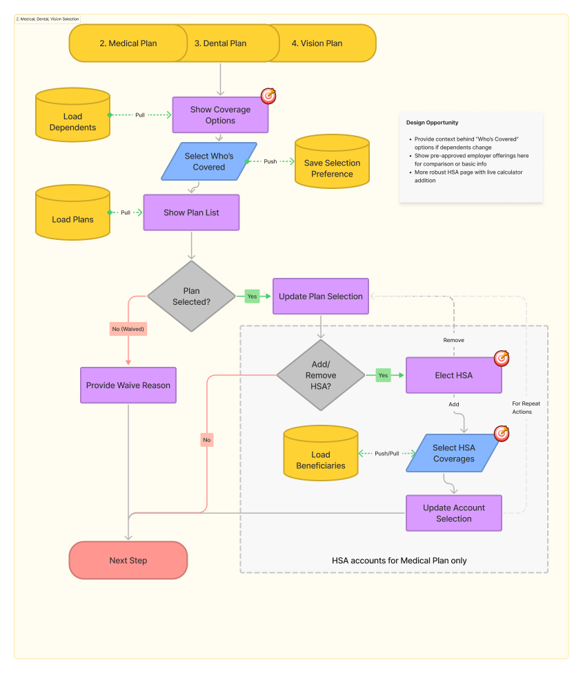
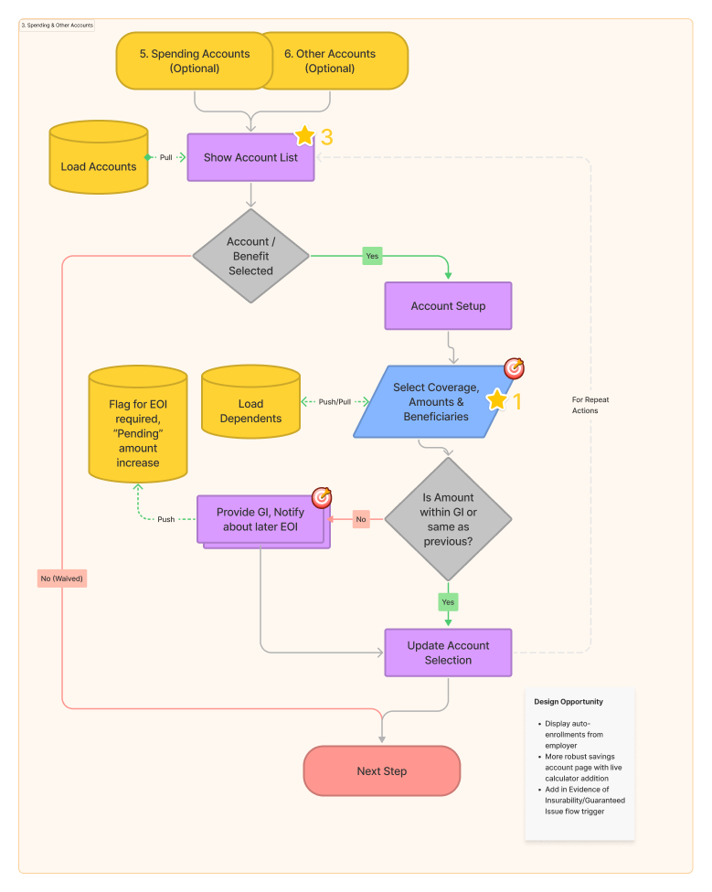
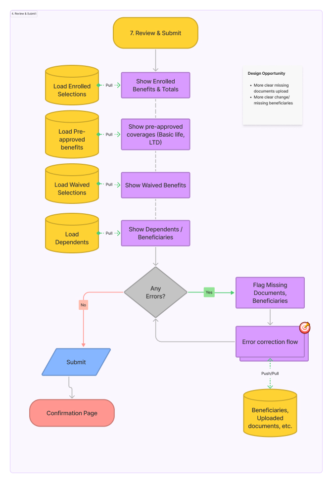
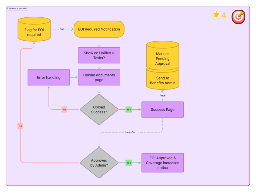
The first priority was to understand the existing open enrollment systems and logic that serve as design constraints and guidelines for what the ideal solution may be.
The second priority was to start defining the information architecture needed to allow employee users to interact with the application in a way that is logical and easy to understand.
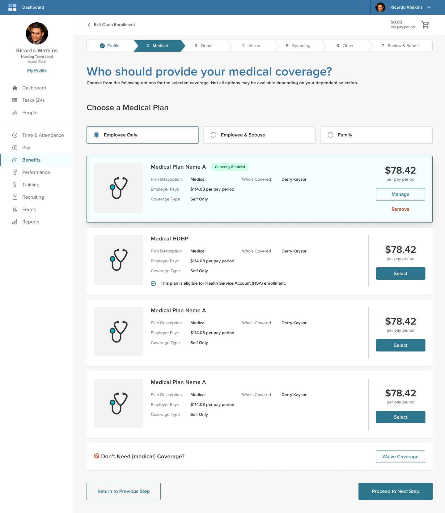
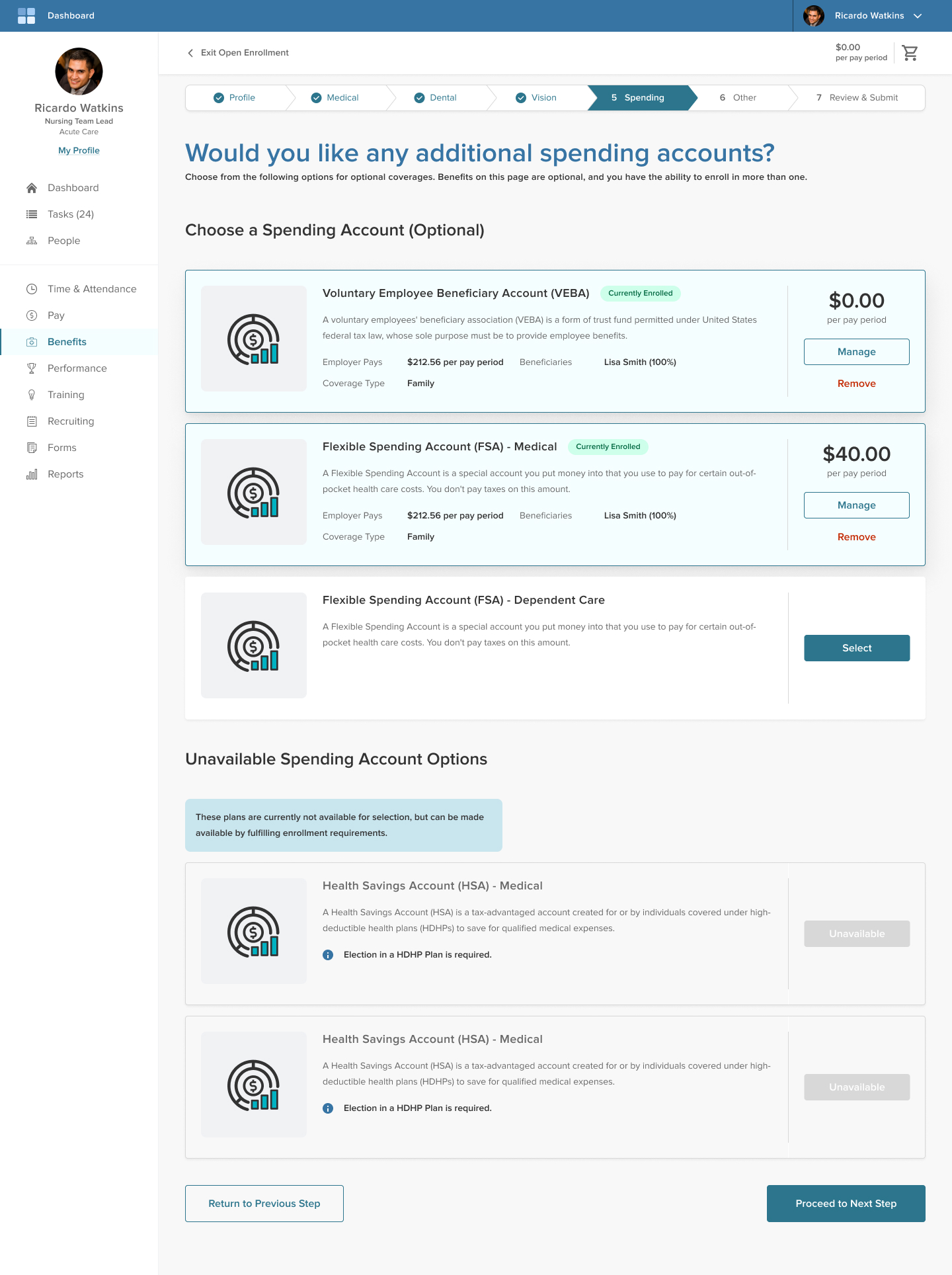
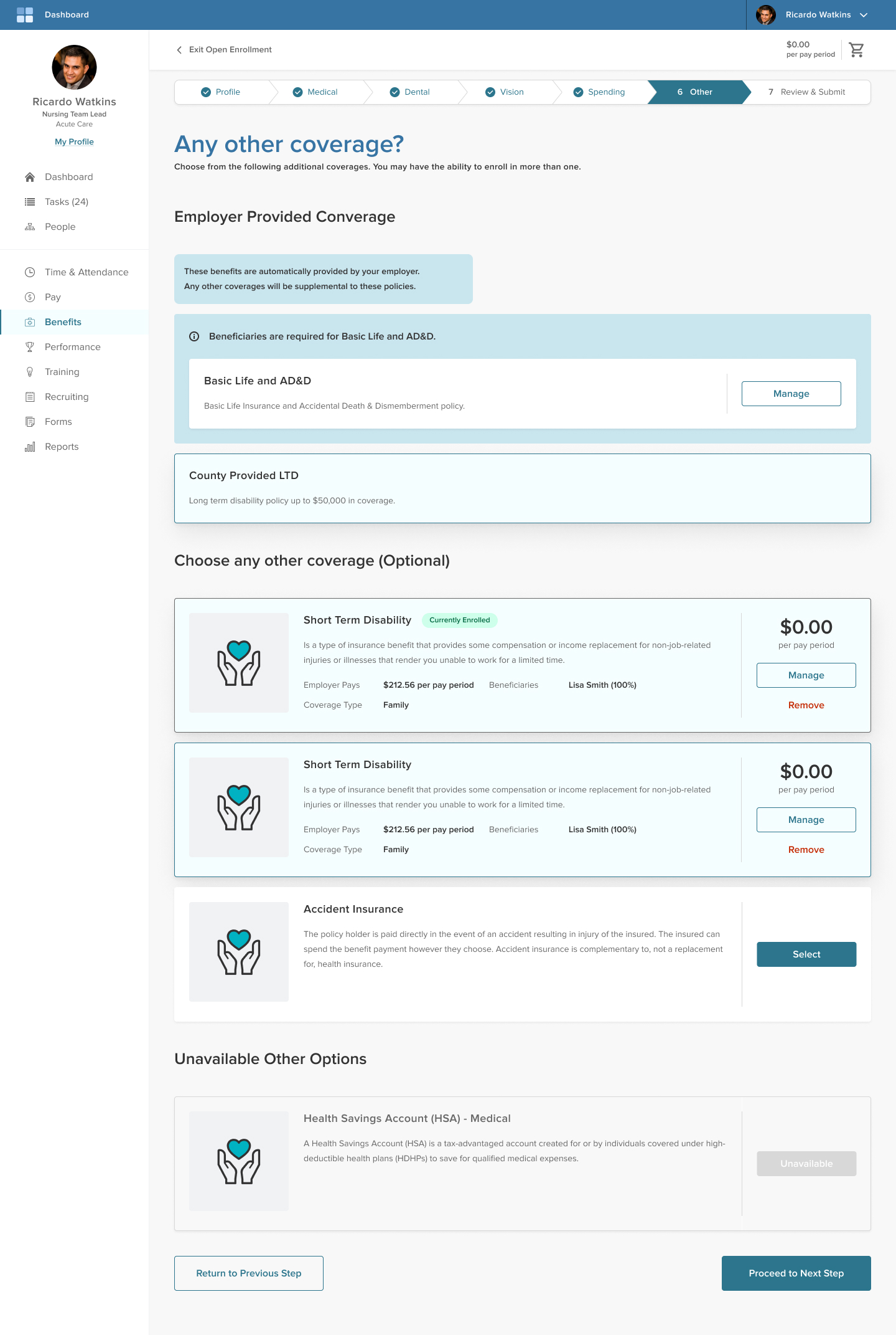
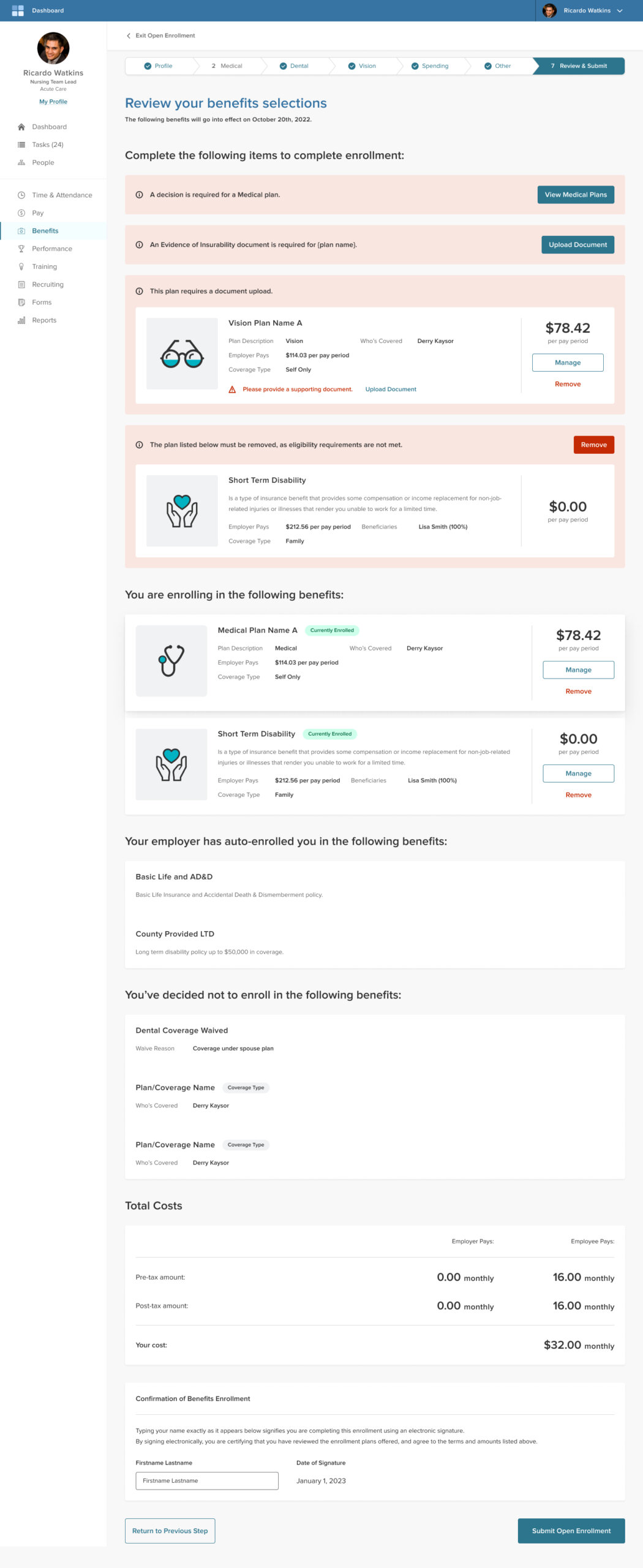
Creating high fidelity UI:
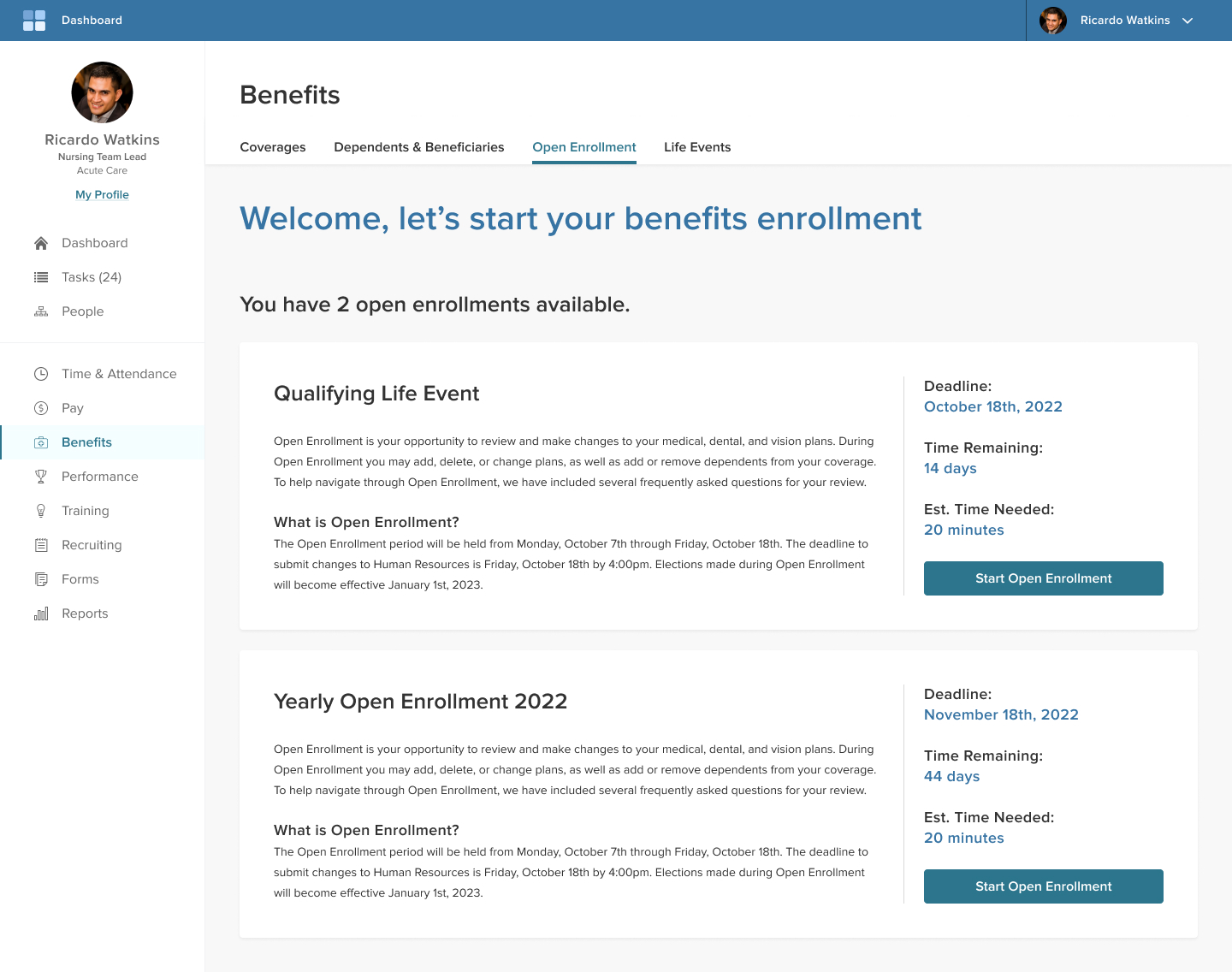
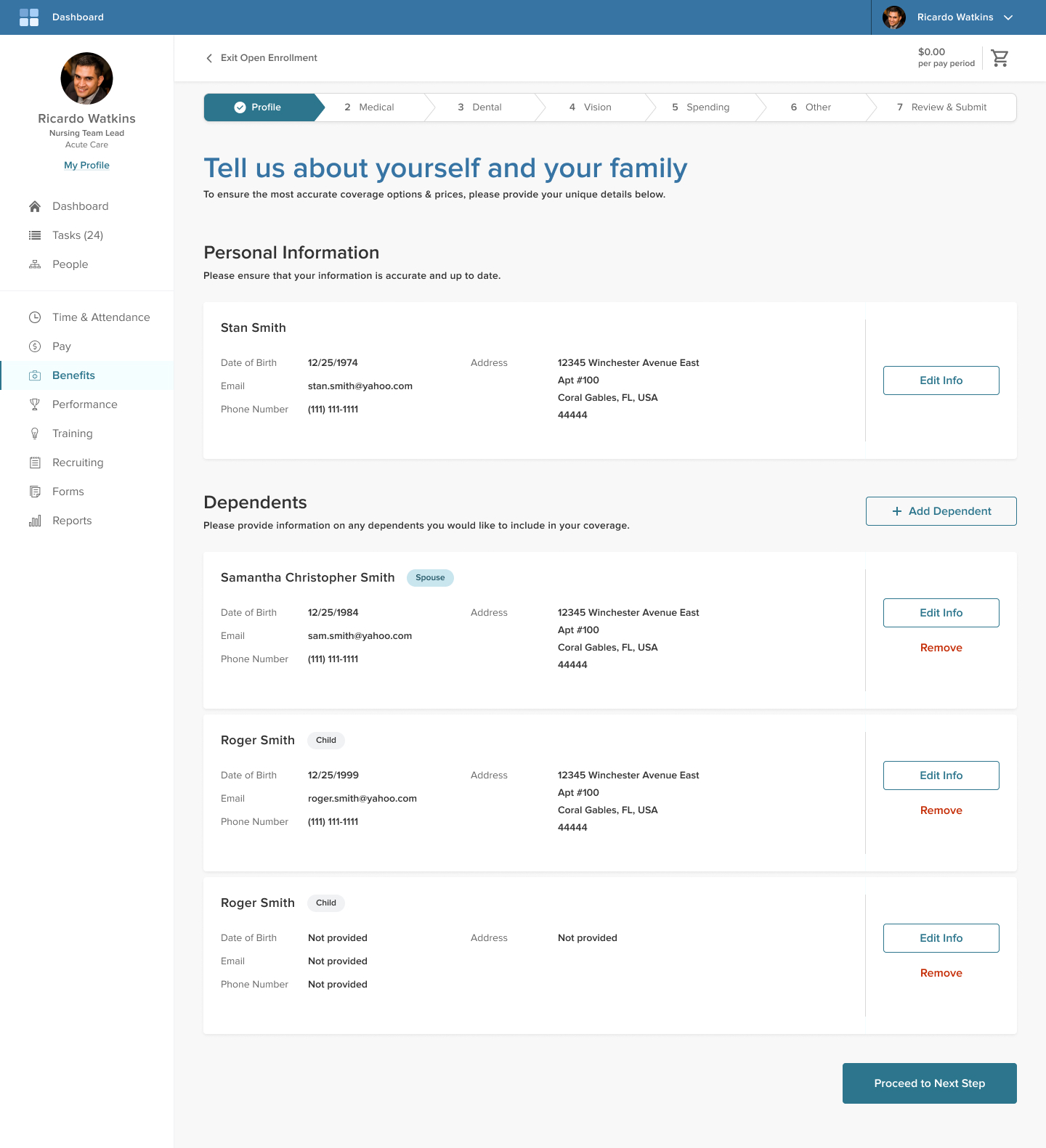
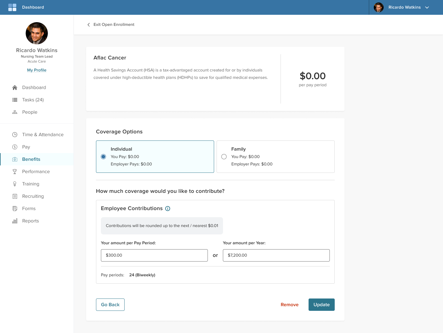
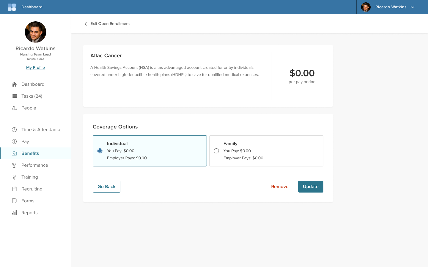
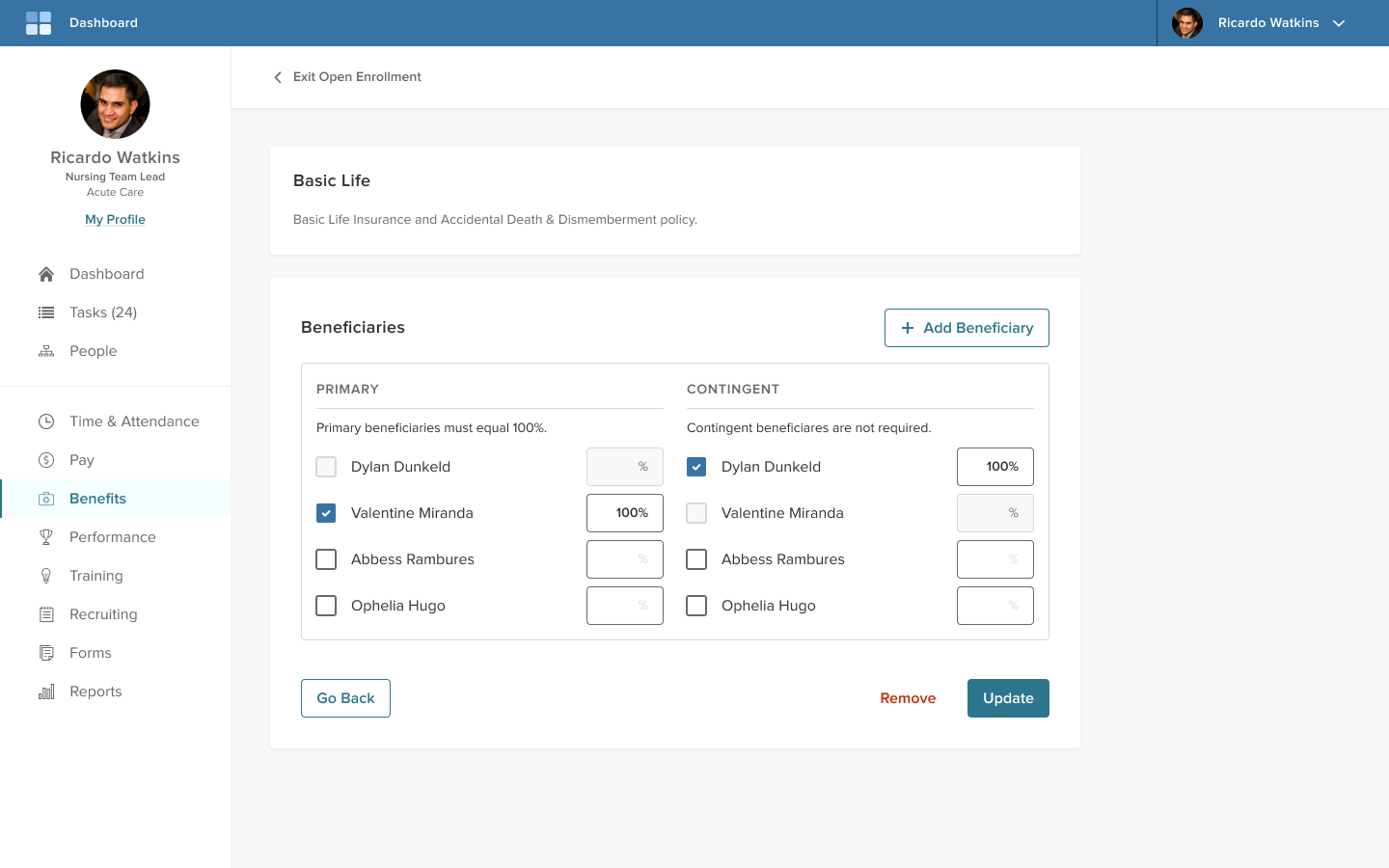
Primary pages
Finally, the third priority was for the design solution to follow the most current pattern library and design standards, which drives how the UI and elements may flow on the page.
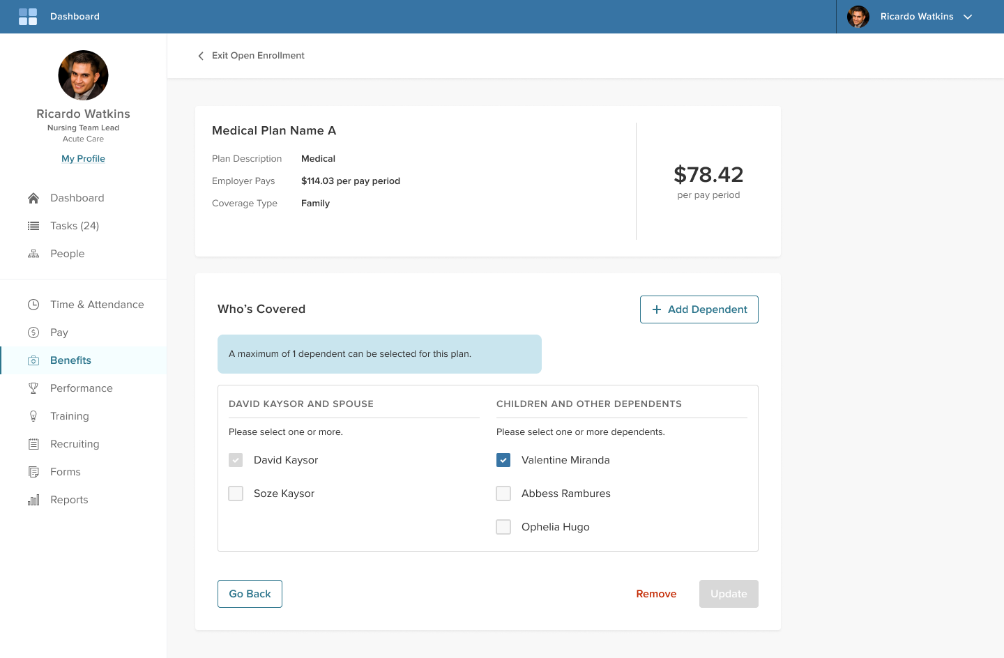
These primary pages drive the main flow of the open enrollment flow.
Creating high fidelity UI:
Secondary pages
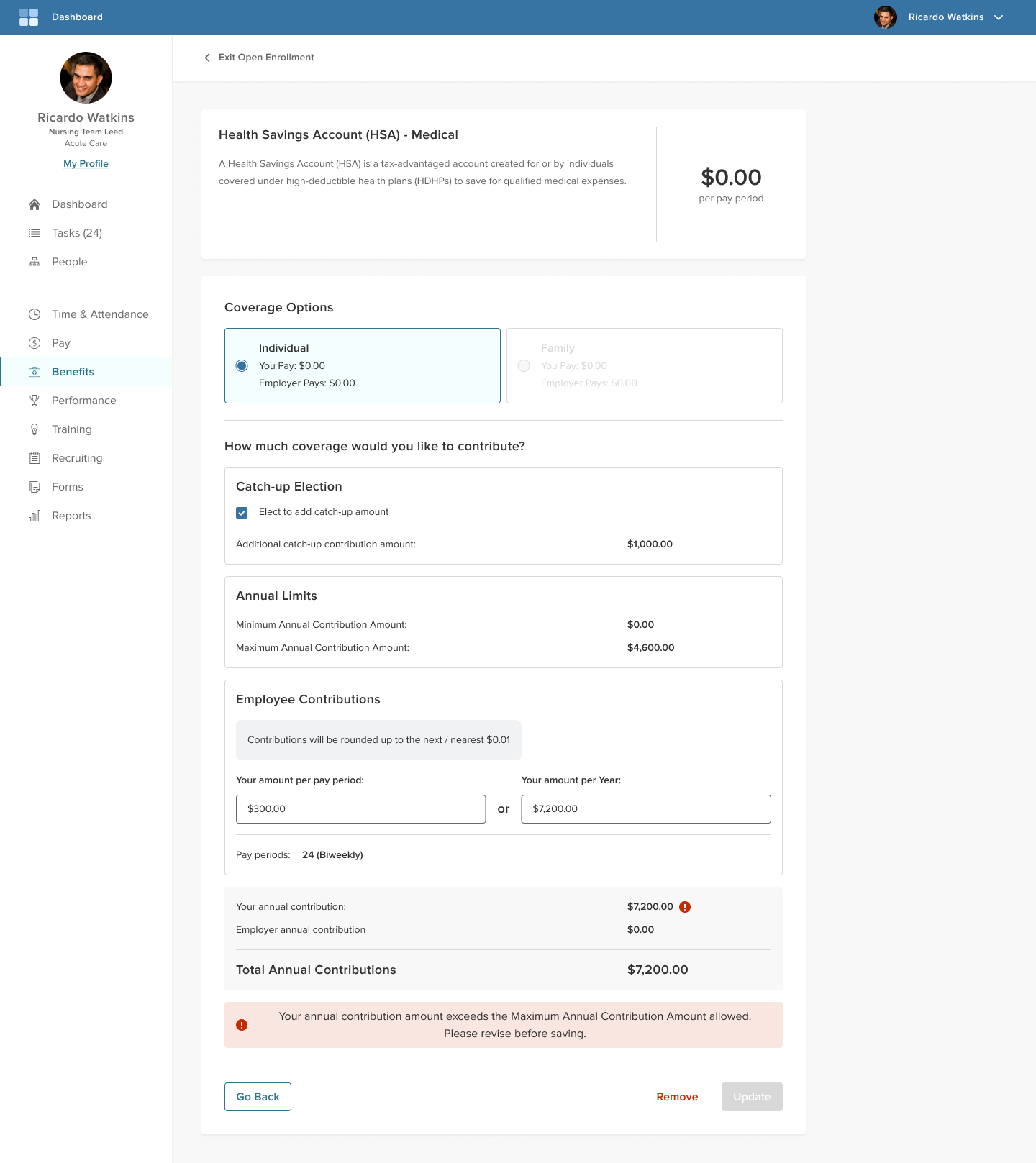
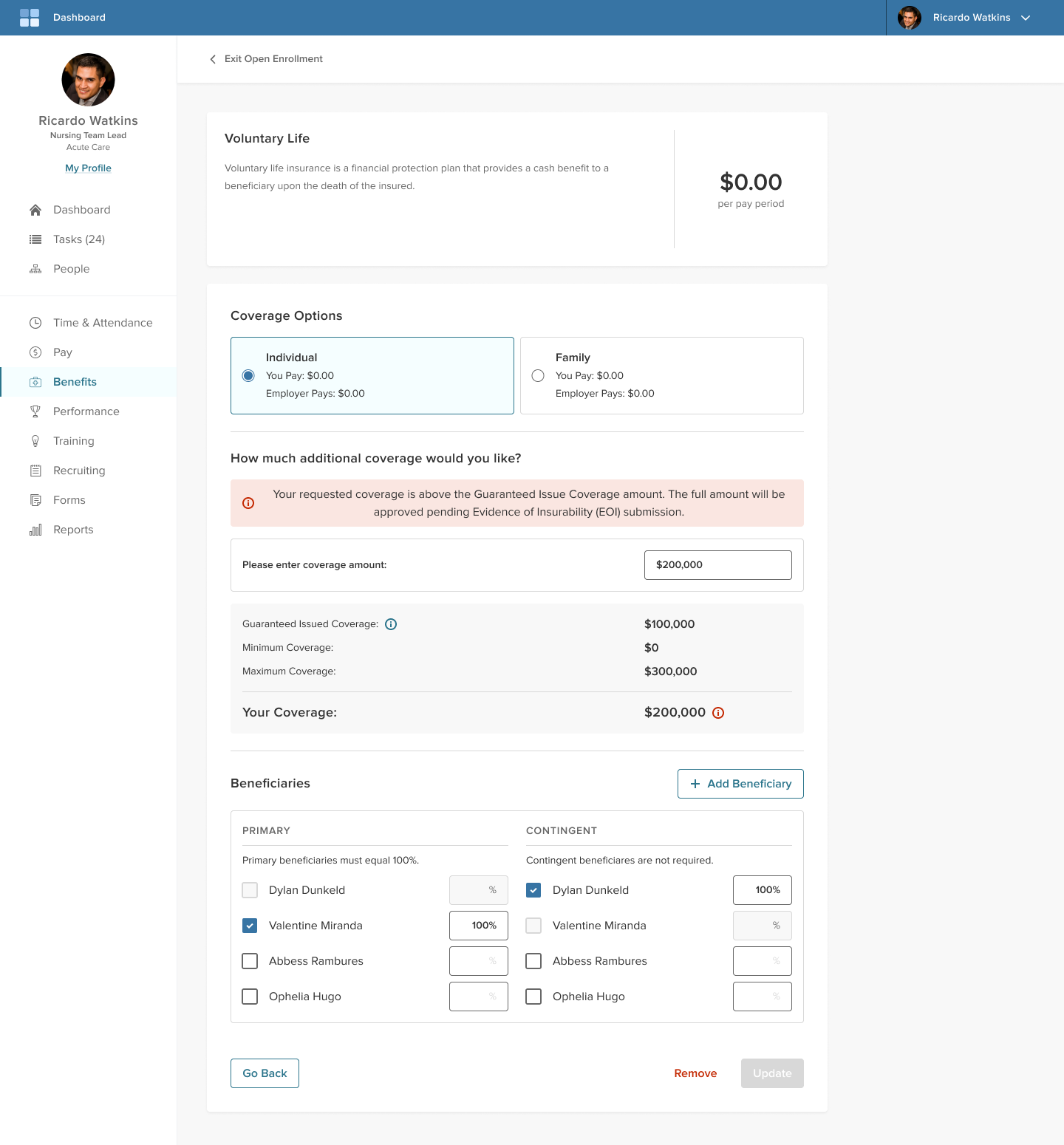
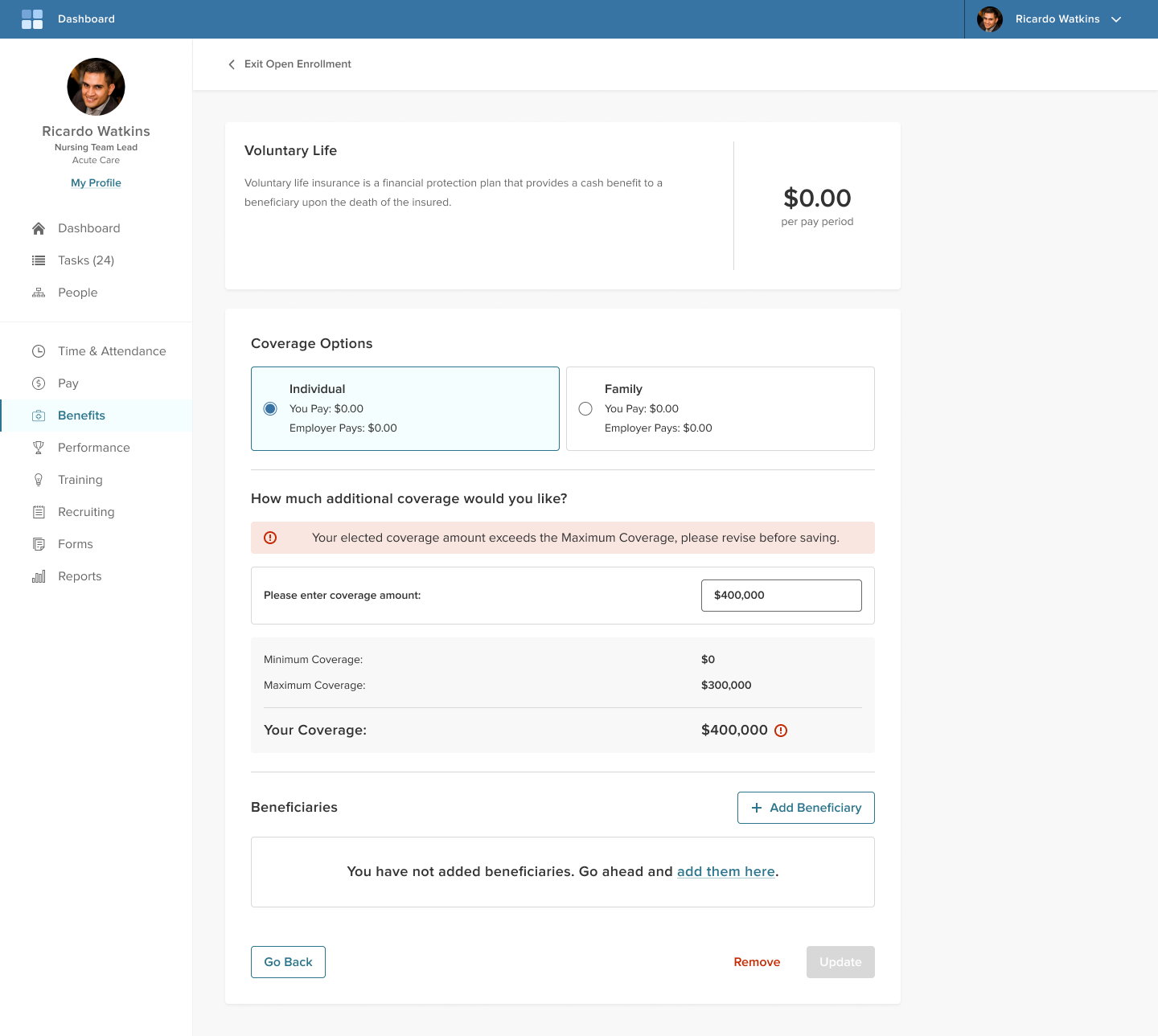
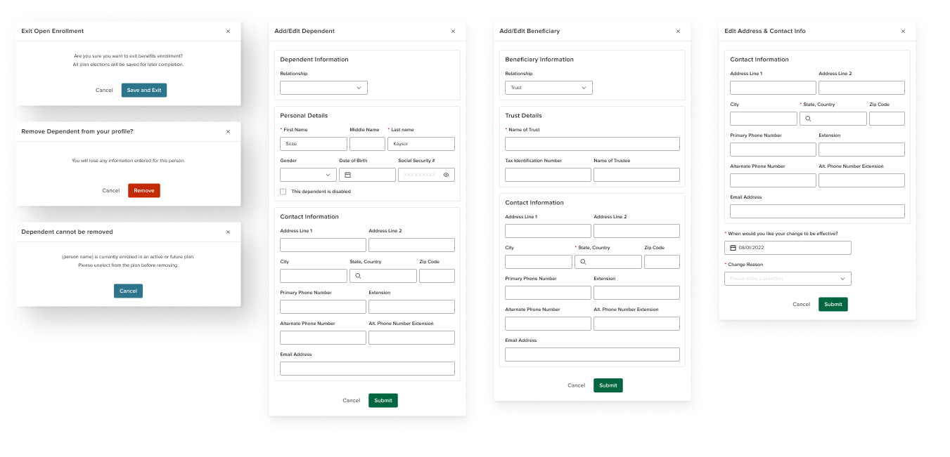
The secondary pages are branching paths from the main flow of completing open enrollment.
These pages and modals drive the many configuration options available throughout benefits enrollment. Important areas to gather user input and settings are conducted here.
Collaboration & Delivery
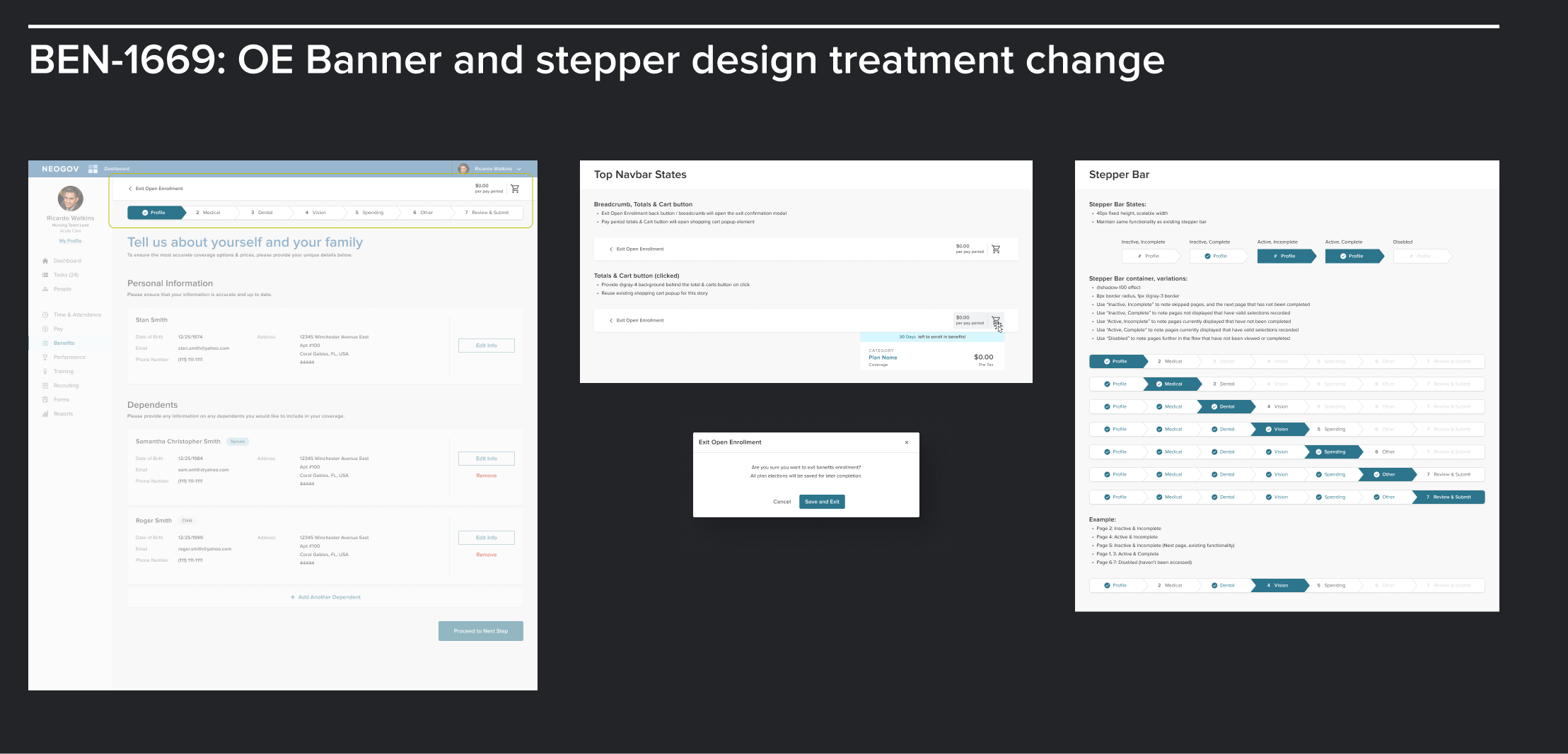
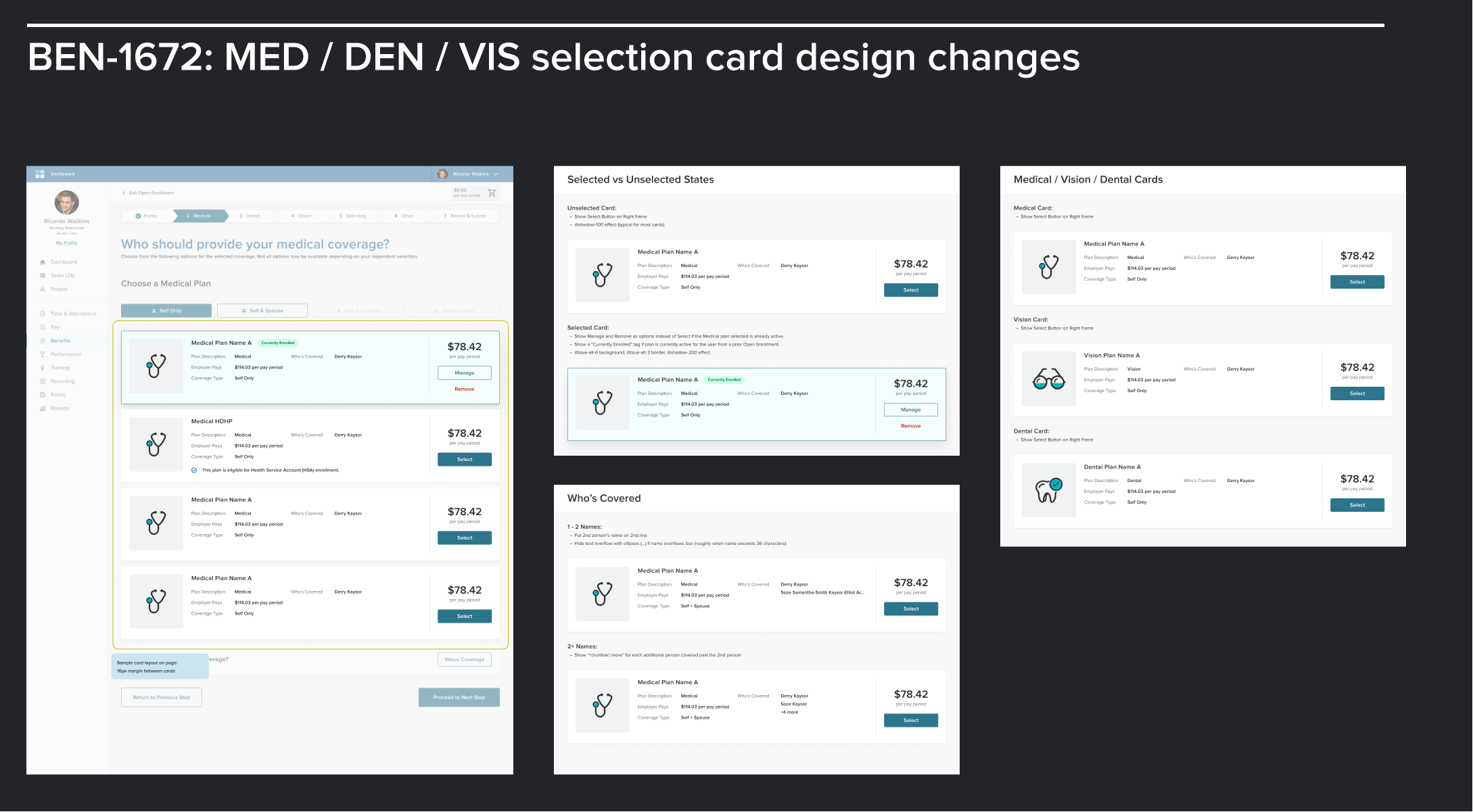
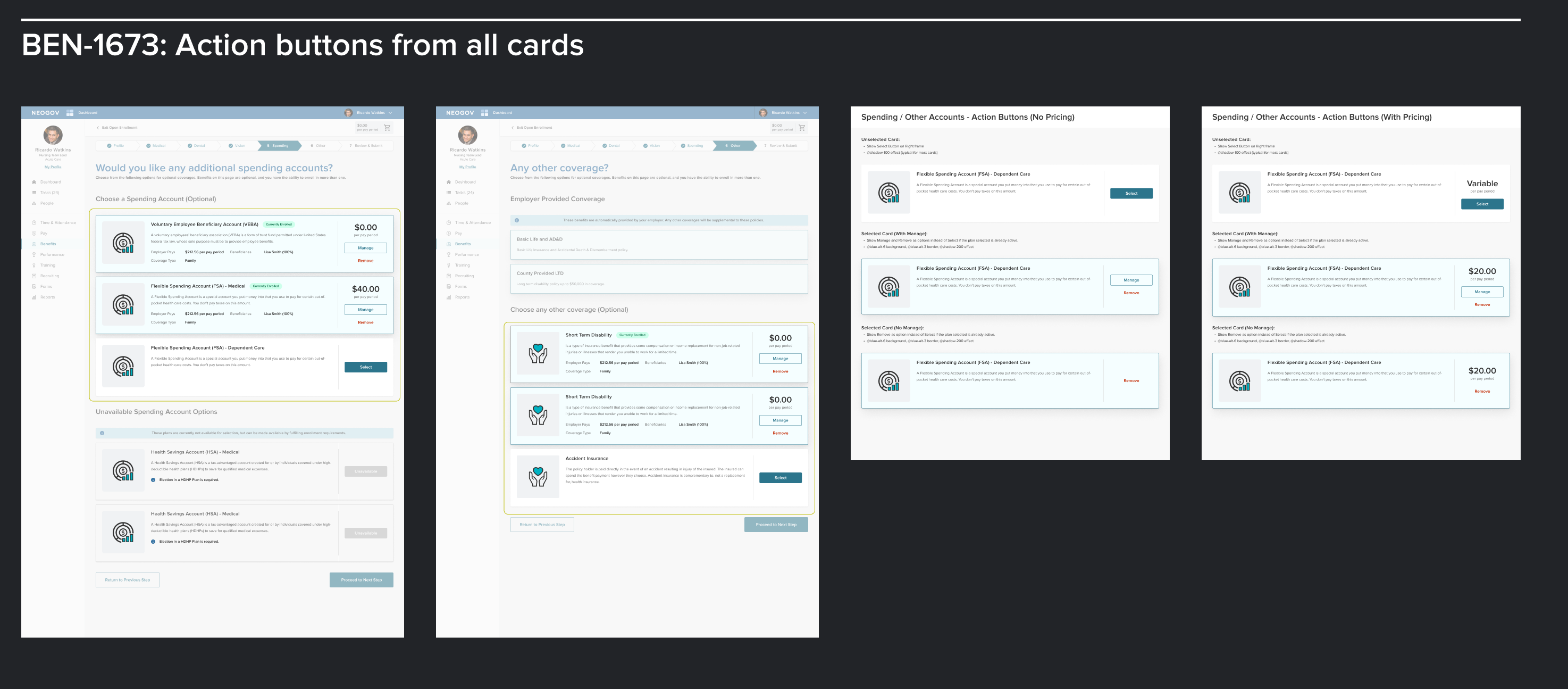
Defining deliverables
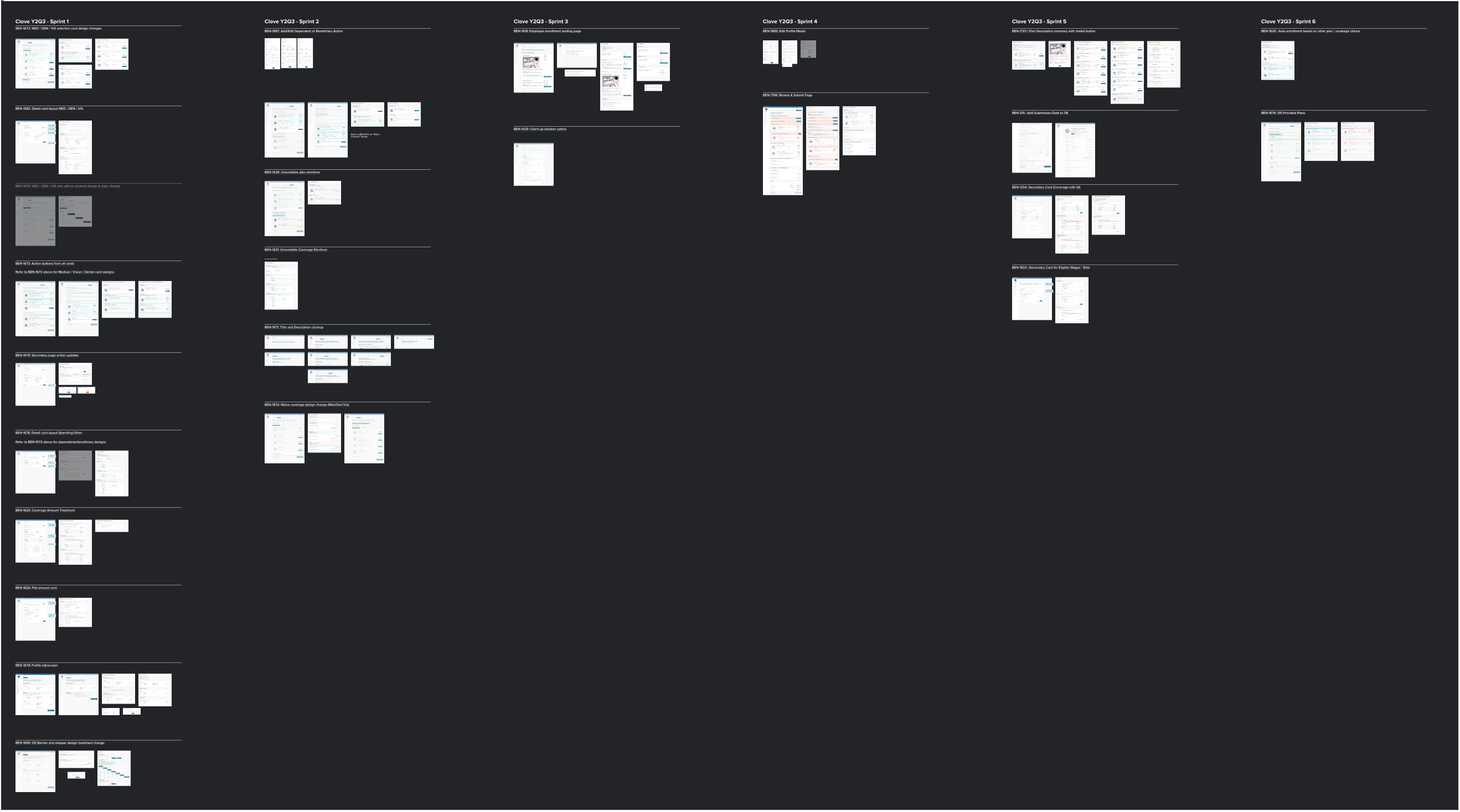
By incorporating an iterative process in 2-week development sprints, the software was able to evolve and improve accordingly, one section at a time.
Deliverables to the development and QA teams was completed by splitting the large overall scope into portioned chunks arranged by Jira story. This ensures each development effort can be reasonably estimated for scope and focused in requirements. Likewise, QA testers have an easy way to reference what should be expected in the final product.
Scaling into production
Streamlined communication and collaboration between design and development was crucial to allow for well-timed and effective sprint cycles.
By prioritizing modular and scalable architecture starting with design, the process for working iteratively, conducting thorough testing, and ensuring a smooth transition to deployment allowed on-time deployment of the product at scale.
Ongoing support & feedback
As the product is released to client employees, client administrators, and internal implementation consultants, additional feedback and analytics are gathered to help facilitate and quantify feature gaps, fix unexpected bugs, and track usability improvements.
