Intersection Music
Background
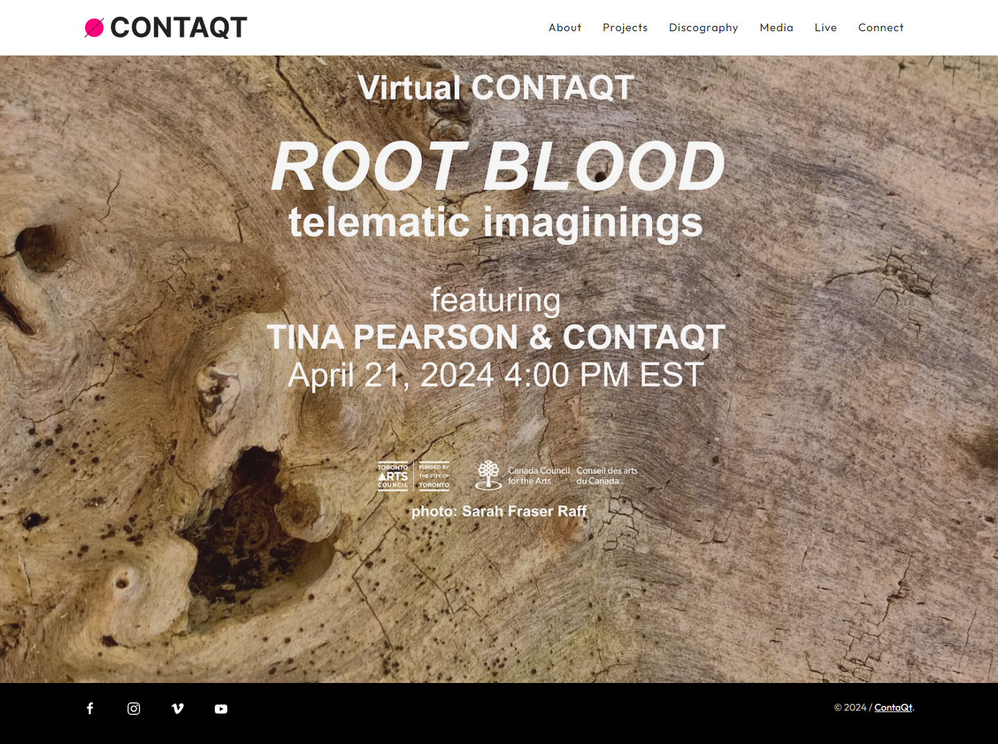
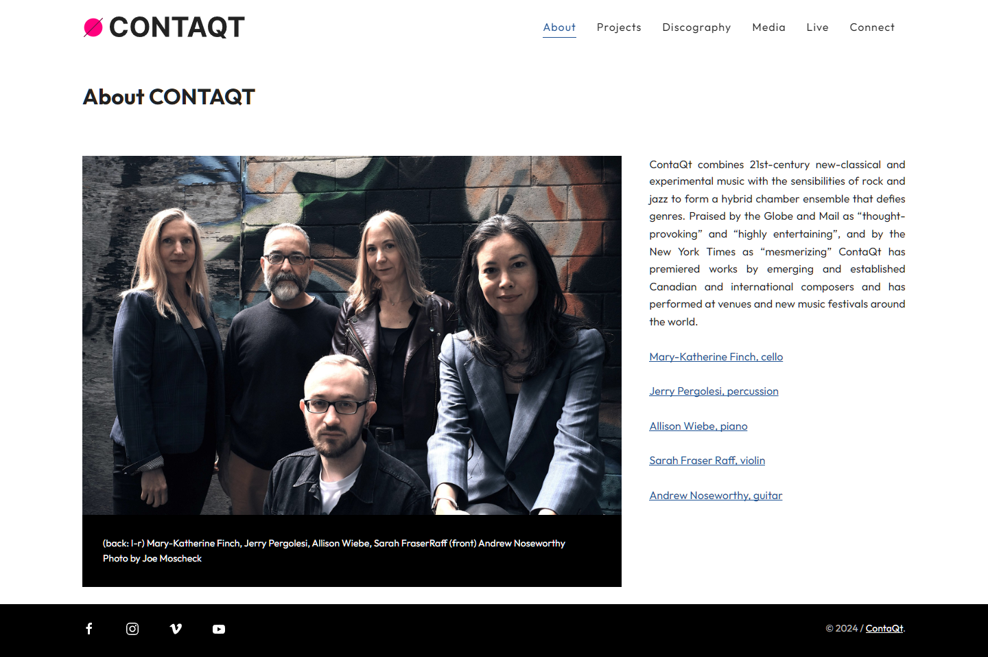
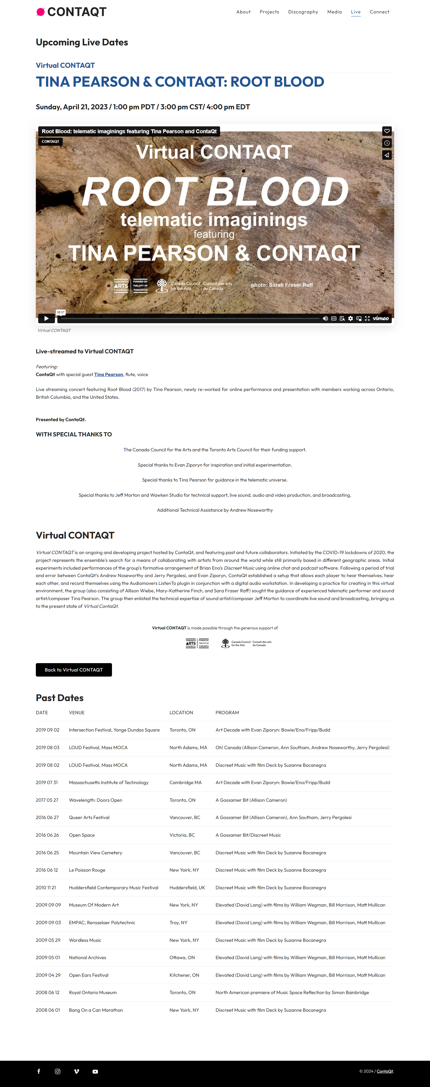
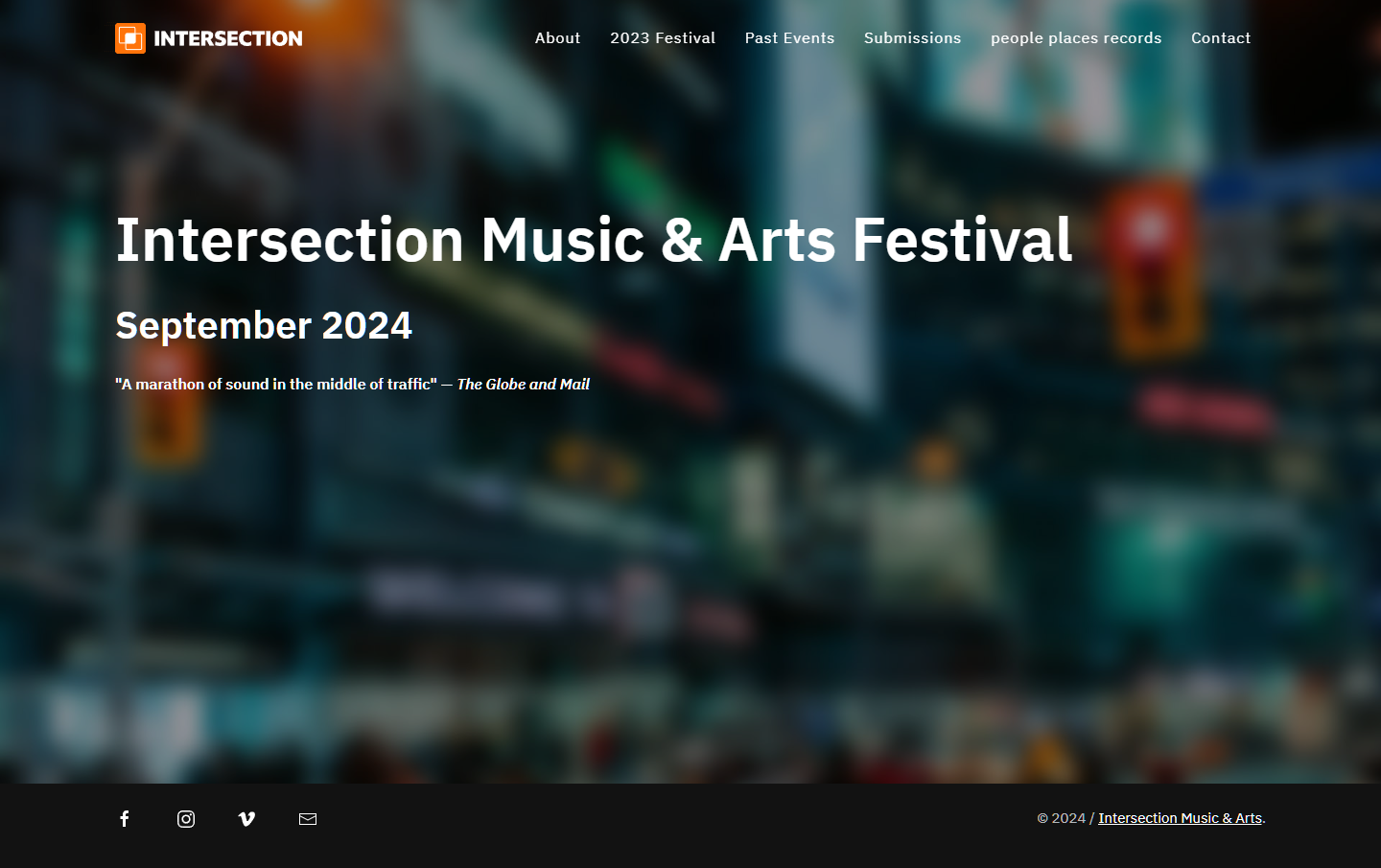
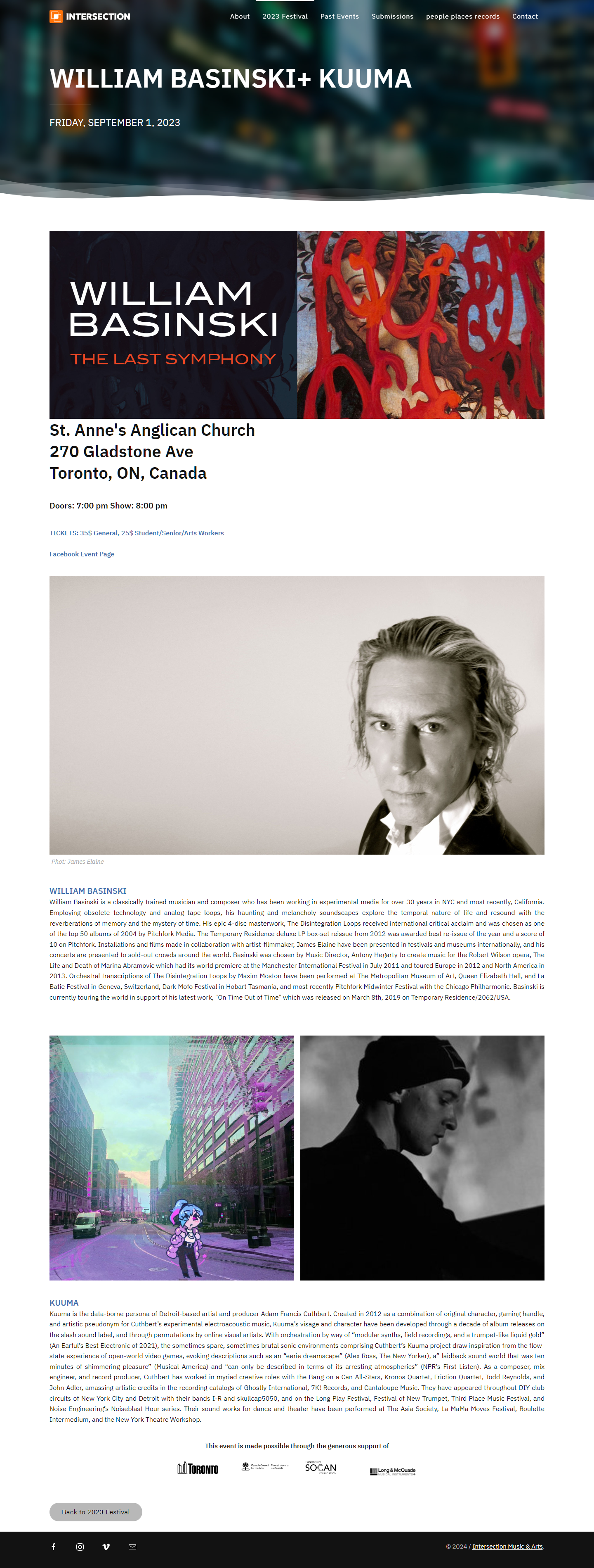
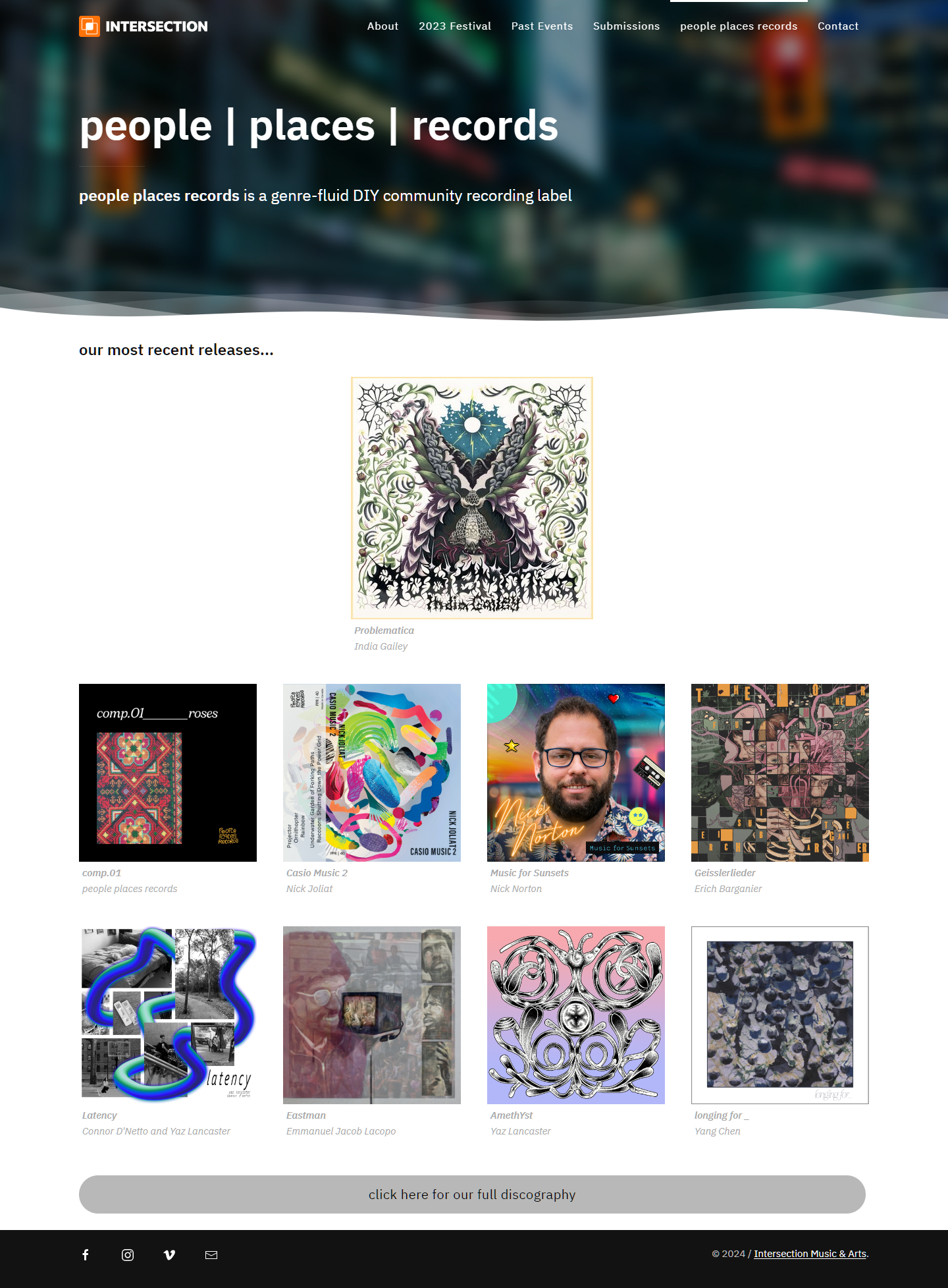
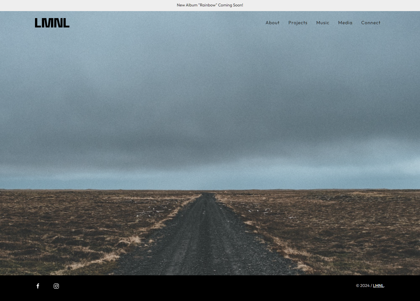
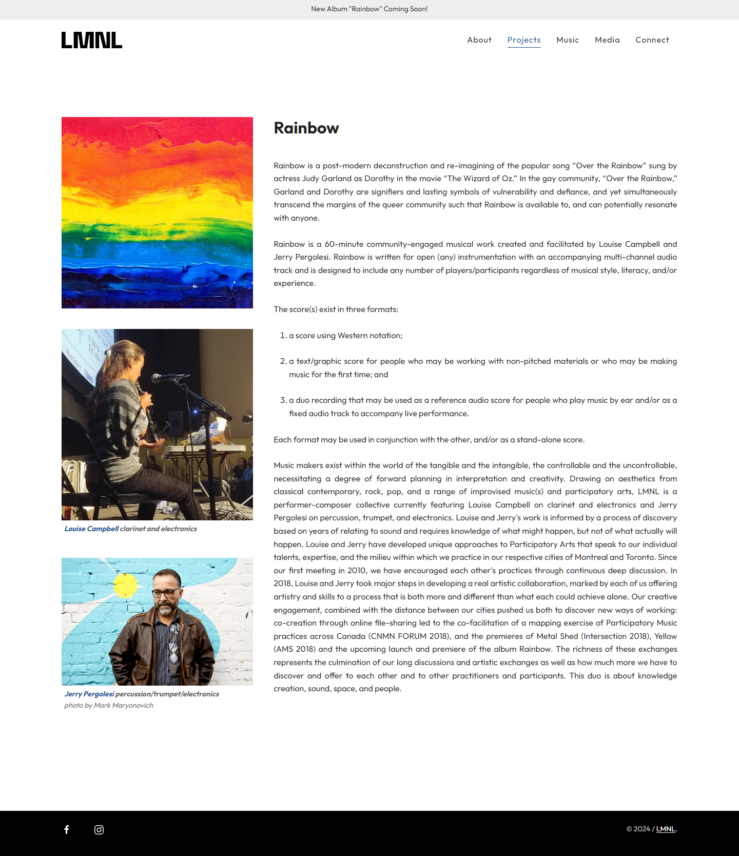
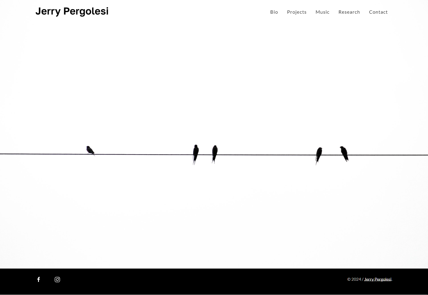
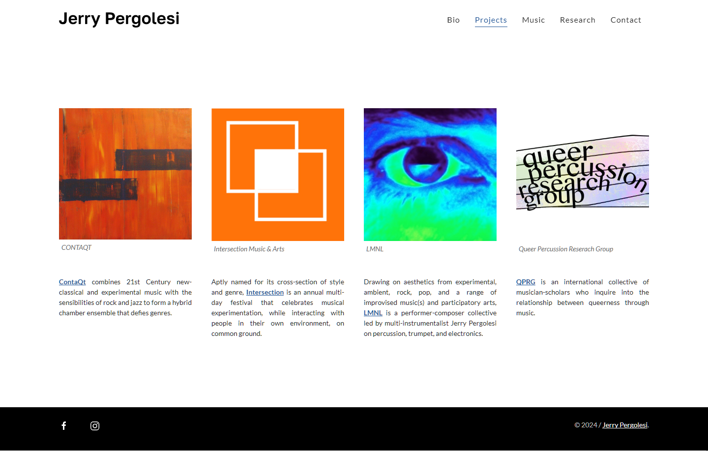
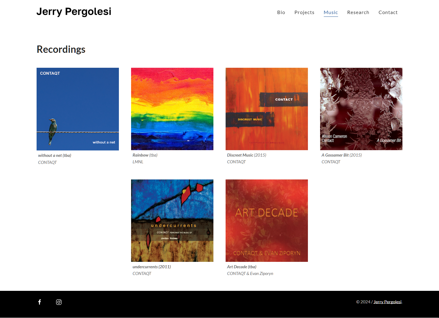
A comprehensive redesign project for a client encompassing four distinct websites showcasing musical projects: Intersection Music Festival, LMNL, Contaqt, and a personal client site. The goal was to create a cohesive and modern online presence for each entity, while ensuring a consistent lightweight framework built on Kirby CMS.
Tools
Figma, Adobe Illustrator, Kirby CMS, HTML, CSS, JS, PHP, Netfirms
Role
Designer & Web Developer – consultation, prototyping, site building, hosting integration, feedback & revisions
Project Timeframe
6 months
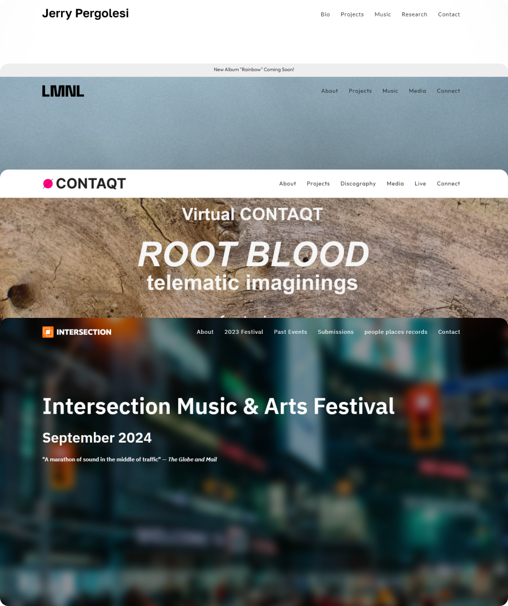
Design and Development
Existing environments
Evaluating the client’s needs, constraints, scalability, and preferences for content management systems (CMS) was the first step in providing a good user-centered service. This was essential to ensure that the any new designs would be compatible with the existing legacy Kirby CMS backend, and scalable long-term.
Figma design and prototyping
While we started with just one site as a pilot, the scalability and resue of site structure and layout across all sites was foundational to the the design approach and vision. Using Figma, I crafted wireframes & prototypes that reflected the desired aesthetics and functionality of the site, balanced with what is reasonably achievable within Kirby CMS. This phase included:
- User flow diagrams to map out the user journey.
- Wireframes to establish layout and structure.
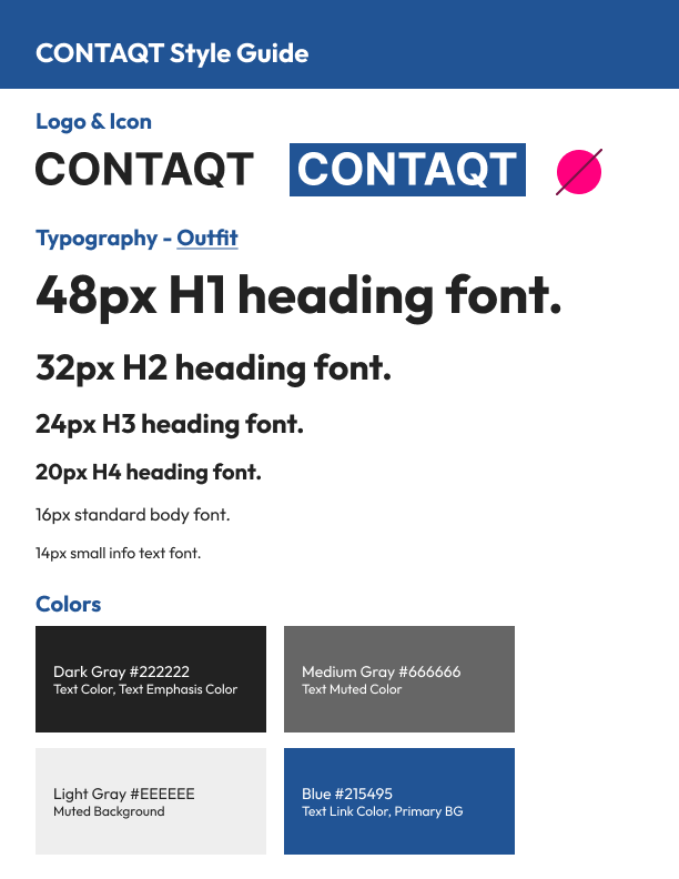
- High-fidelity designs to showcase the final look and feel.
- Production-ready SVG branding & logos
Developing for Kirby CMS
Once the designs were approved, the next step was to bring them to life using Kirby CMS. This involved:
- Creating a local instance for initial development and deploying the CMS to the webhost as a staging environment to test.
- Researching documentation for best practices and required dependencies.
- Developing all of the site pages to match the Figma designs within the Kirby CMS framework.
- Testing responsive design for optimal performance on all devices.
Delivery and Support
Before and after: Intersection
- Before: The old Events page contained rudimentary design elements with simple hyperlinks, and no central landing page for past events.
- After: The new Events page features a cleaner page with large thumbnails showcasing the artistic posters done each year, and is a central hub for all previous events.
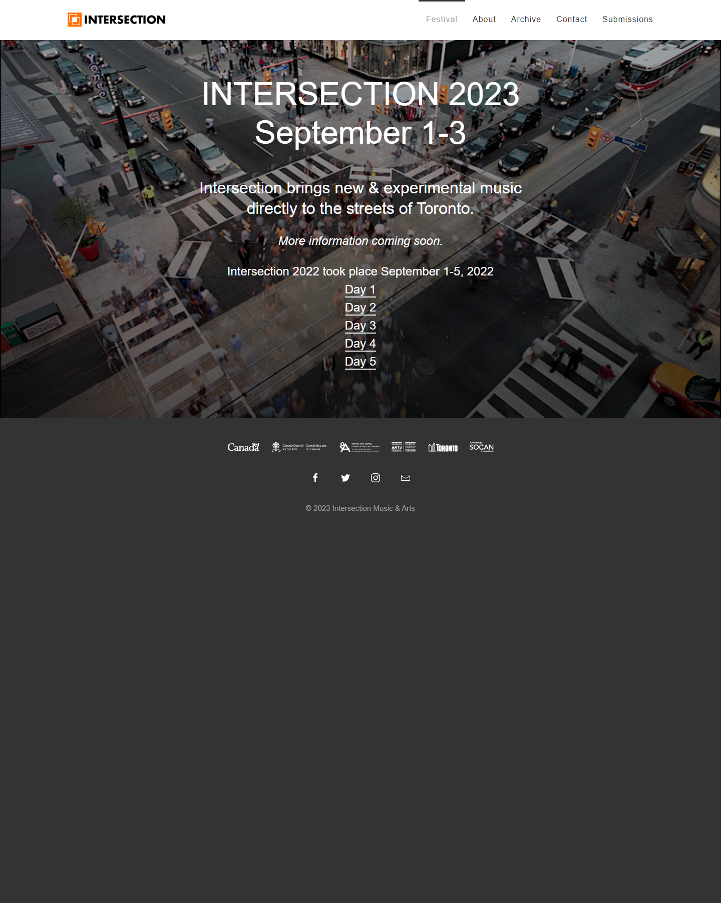 BeforeAfter
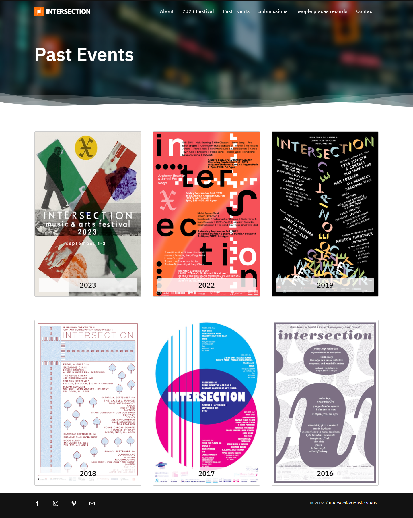
Deployment and scaling sites
Once the pilot site was built out and tested, the staging site was pushed to the live URL with no issues.
This successful launch allowed us to roll out the remaining 3 sites at a much faster pace – each subsequent iteration took 50-75% less time to design, develop, and deploy. Other steps included:
- Configuring each domain to another instance of a Kirby CMS deployment.
- Providing high-resolution raster and vector assets
- Providing training and documentation emails for content management best practices in Kirby CMS.
Conclusion
The redesign of Intersection significantly improved the aesthetics, functionality, and user experience over the existing sites. Furthermore, the designs created for the client within the Kirby CMS framework allowed the site(s) to be easily deployed and leveraged elsewhere as partner sites with minimal time & investment.
In this way, we were able to create both a unique presence for each site, as well as a unified backend CMS experience for the client to tie all of them together. This collaborative approach ensured that the final products met expectations and business goals easily with great satisfaction.

