Timesheet Management
Background
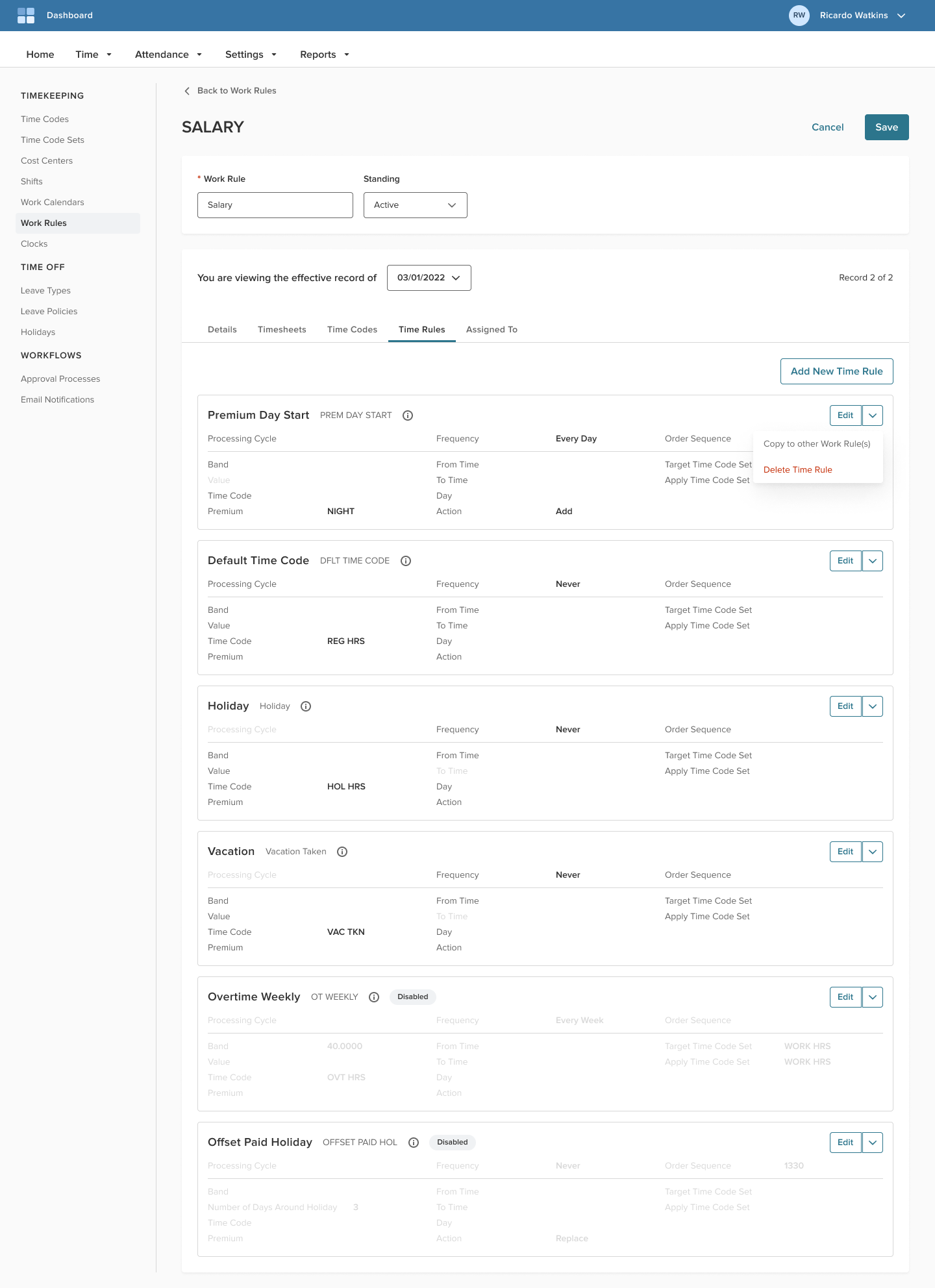
A new dashboard screen and overhaul of the setup flow for a timesheet tracking software – redesigned with the client administrator and implementation consultant’s workflow in mind. This project is a small portion of a larger initiative to modernize multiple product backend screens with current technologies and UX design.
Tools
Figma, Sketch, Jira, Gainsight
Role
Product Designer – strategy, wireframing, high fidelity assets, analytics
Project Timeframe
8+ months
Overview
Project Goals
Modernizing the setup flow and creating the dashboard enhanced the administration experience through:
- Decreasing the implementation cycle time
- Increasing performance with a modern Angular tech stack
- Cleaning up information architecture and sunsetting legacy screen
- Simplifying usage and navigation for clients
Discovery Process
The basis of improvements we wanted for administrators was conducted with the following conditions in mind:
- Auditing existing workflows and legacy screens
- Incorporating feedback from Project Managers and Implementation Consultants
- Identifying product gaps that exists through competitive analysis
Iteration & Innovation
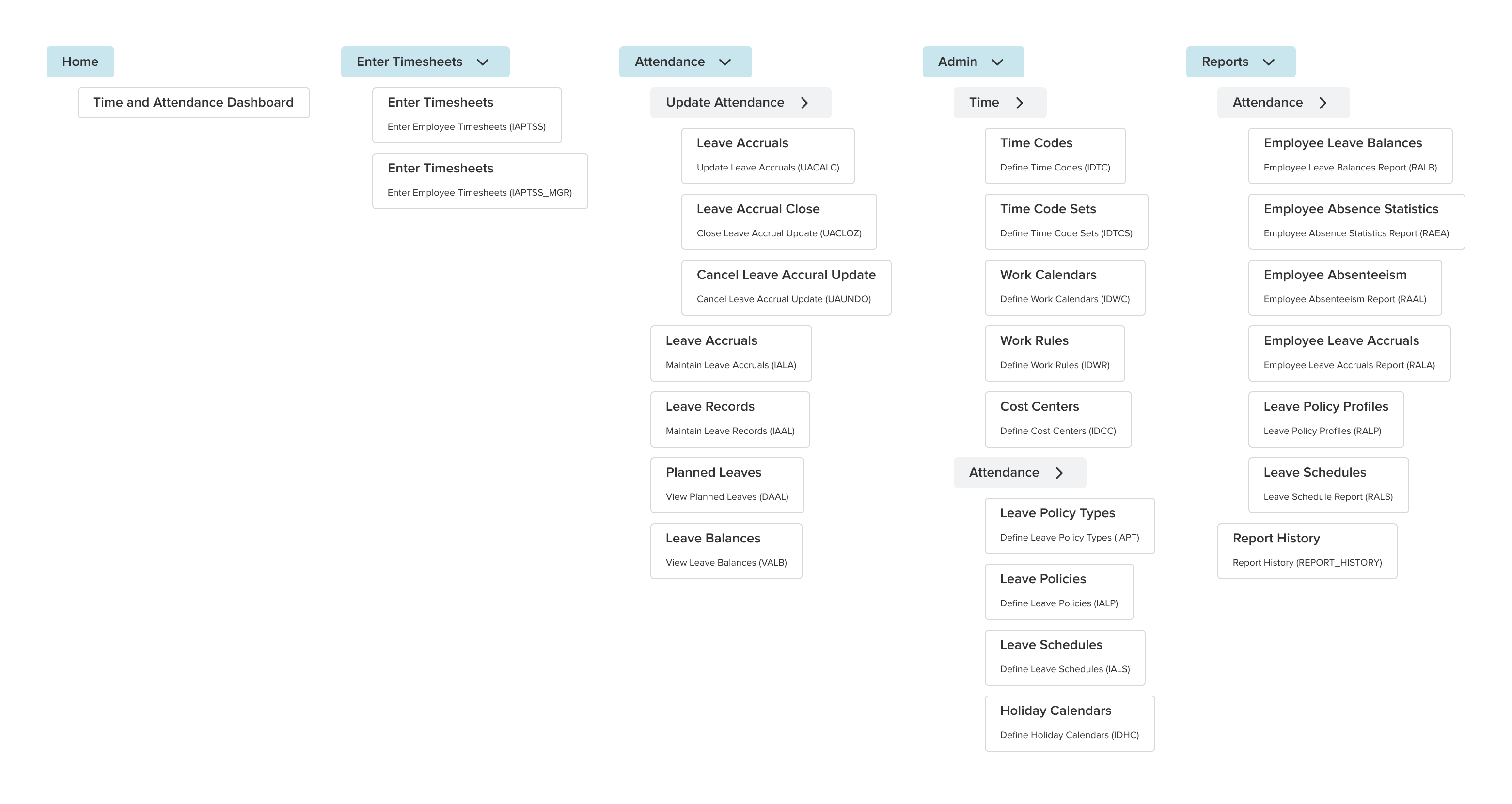
Existing information architecture and workflows
Through auditing existing workflows and legacy screens, a list of most used features and screens were prioritized based on frequency of usage, and ease of modernizing into an Angular 16 tech stack.
One large consideration was how best to revise the existing flat “Page Code” hierarchy that relied on an external manual to navigate, into an information architecture that was deeper and easier to navigate logically through natural discovery.
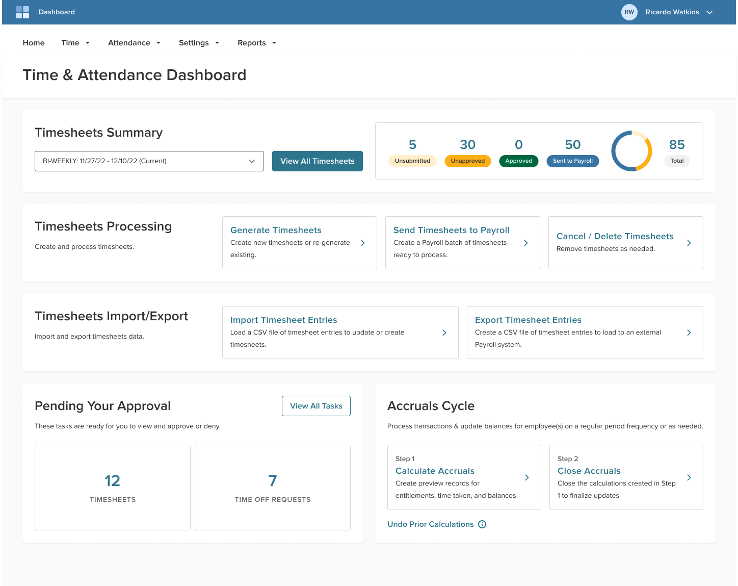
Creating the Timesheet Dashboard
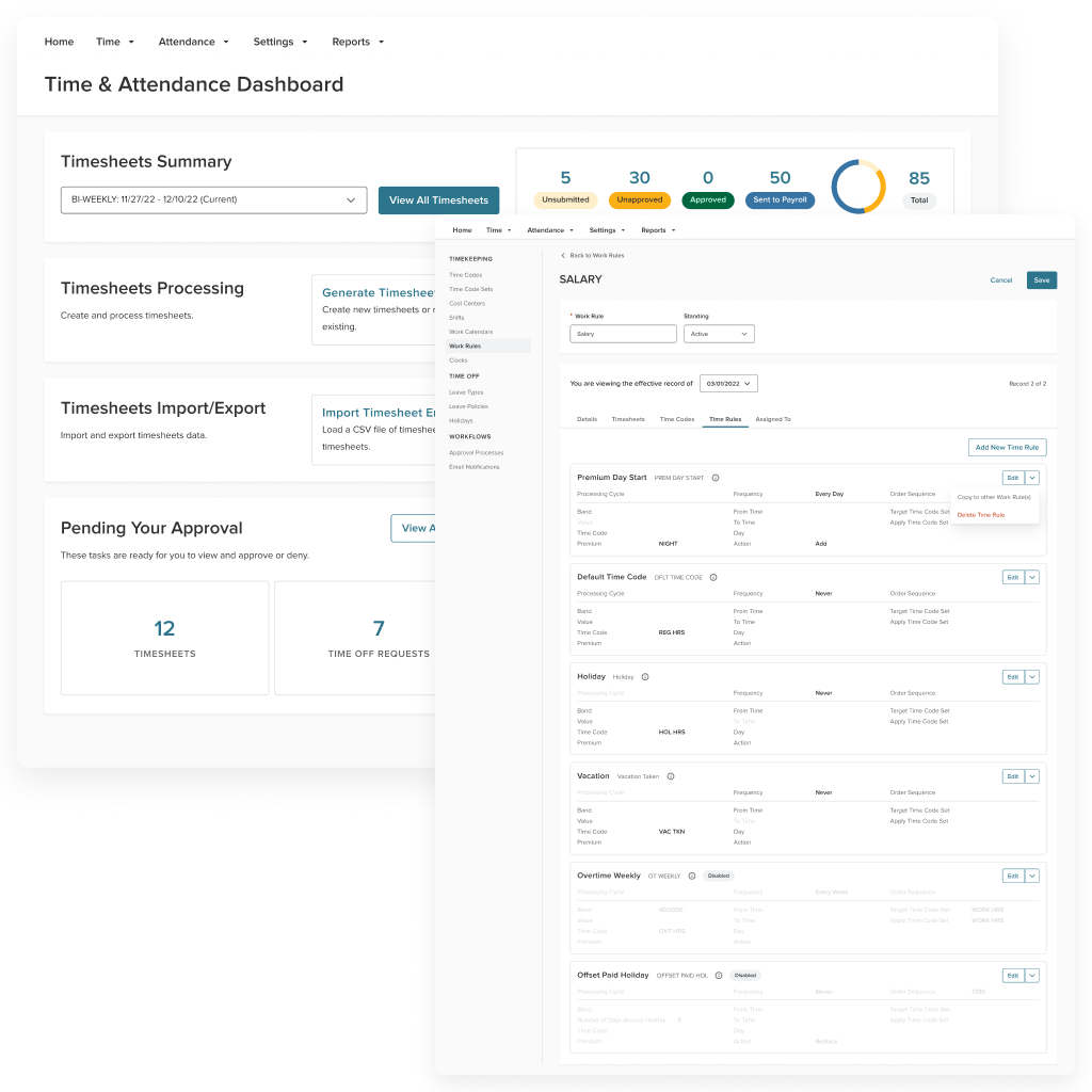
The dashboard design came together through bundling the most commonly used flows an administrator would do for timesheet and attendance tracking, and presenting these flows as easy to use cards and important metrics at a glance.
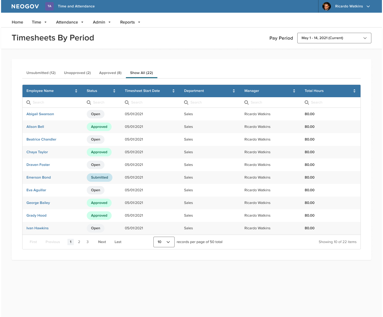
The most used legacy process screens were modernized and implemented as modals that can be called directly from the dashboard, decreasing reliance on memorizing page code (URLs).
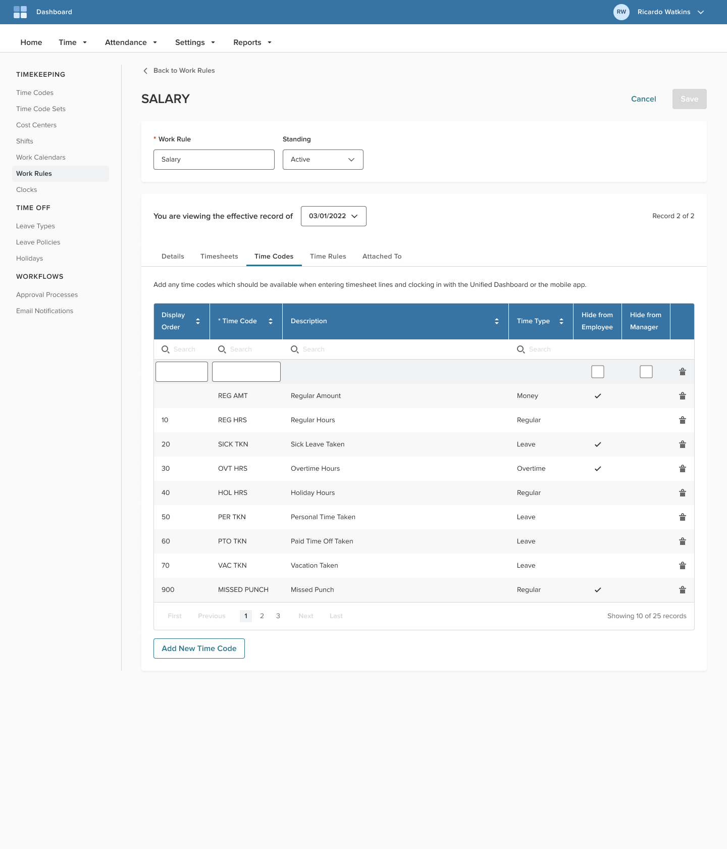
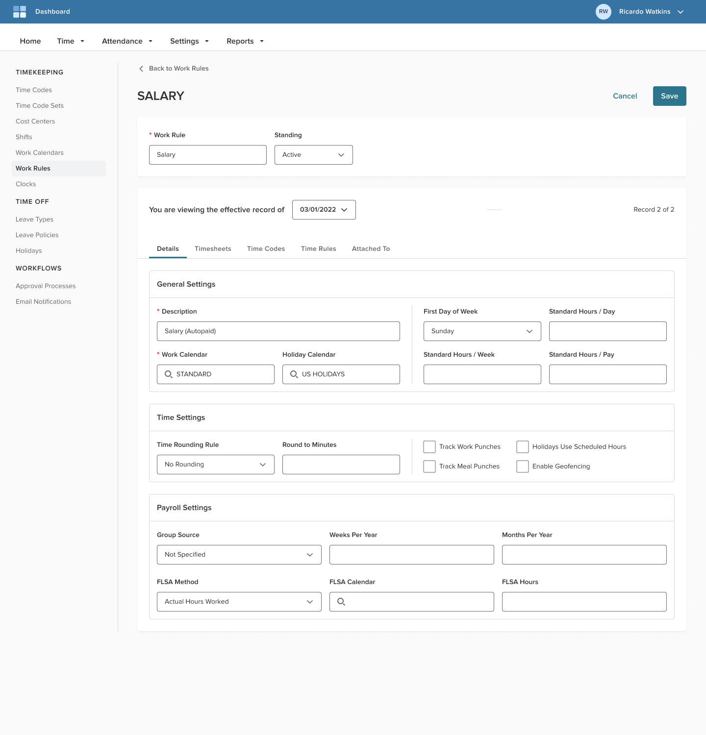
Modernizing Admin Settings
The modernized setup screens consist of two design frameworks:
- The first is a sidebar navigation component that is deployed on all related product settings screens, and forms the basis for enabling a deeper information architecture hierarchy.
- The second is a collection of setup screen content that collectively forms designs and interactions from which other setup screen templates can be created.
Collaboration & Delivery
Defining product scope and development
Working closely with Product Management, Development, and the QA teams in agile 2-week development sprints, the design concepts were scoped into manageable chunks across several quarters as Jira stories.
Each deliverable included high-fidelity screens, modals, tooltips, toasts, and additional notes or explanations for other UI and logic behaviors.
Closing the agile loop
By working through several iterations of modernization sprint cycles, our product team became very efficient and learned about how to best build modernized front-end screens that worked well on top of the existing back-end.
Opportunities to document and create components and replicable design and code patterns emerged through this work, and it allowed these patterns to grow beyond just our product, and create order and structure among other analogous products as well.
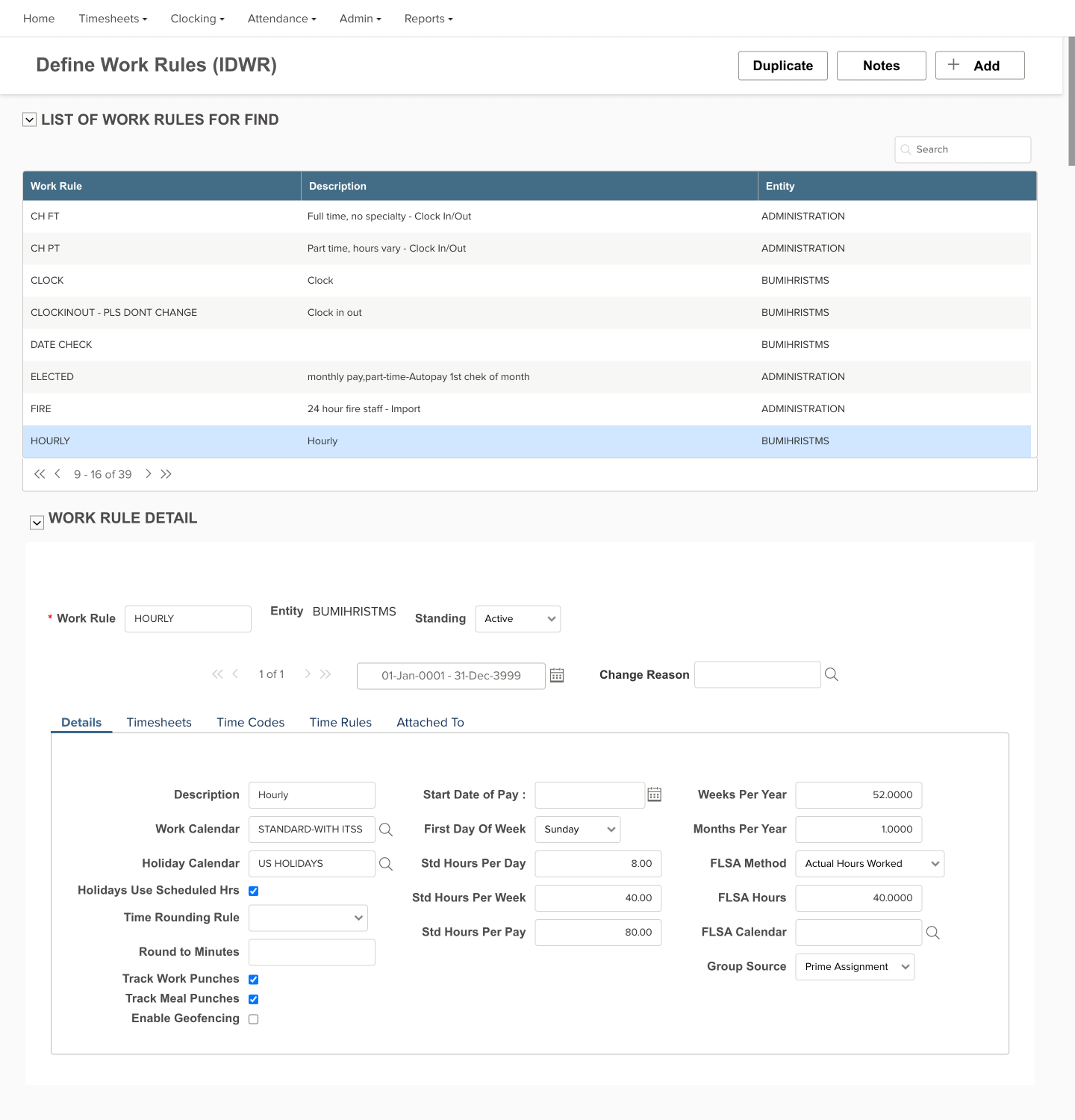 BeforeAfter
Impact & feedback
- Implementation cycle time had decreased from up to a few months to several weeks as the cumulative result of easier setup workflows.
- The Dashboard design and Settings screens received good client and stakeholder feedback, and are leveraged as examples for other product teams to use to build out their own dashboard and settings screens.
- Simplifying the page hierarchy vastly improved page discoverability, and serves as the foundation for unifying this product into a cohesive platform ecosystem.
