
🚀 Shuddle App demo / 📖 Documentation /🎨 Figma designs
Project Information
Background
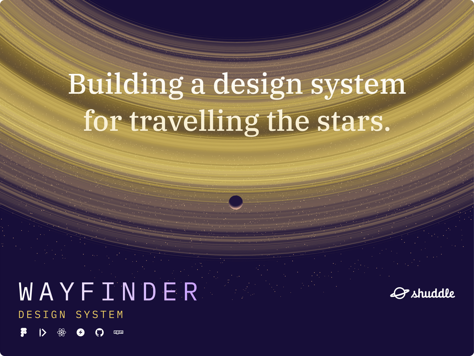
Created for Dan Mall and Dribbble’s Scaling Design Systems course, Wayfinder is a design system built to help leverage the power of components and tokens when creating web apps. The product spans across design, code, and documentation to ensure a holistic approach.
Tools
Figma, zeroheight, React, Chakra UI, GitHub, npm
Role
Product Designer, Front-end Developer
Project Timeframe
4 months
Mentor
Charles Christie
Overview
Project Goals
Tasked with the fictional task of rebranding a interstellar travel agency’s website from “IPTS” to “Shuddle”, my goal for this project was to audit the various design components and patterns used and then consolidate them in an efficient and logical way for quick deployment and updating.
To meet this requirement, design tokens were created for foundational elements like spacing, typography, and brand colors. UI elements like buttons and input fields were formalized, and repeated UI patterns were also componentized in design and code. Finally, guidelines for implementation and usage were documented for all to use.
Discovery Process
The discovery process included some competitive analysis of existing travel and transit products, as well as using ChatGPT to generate ideas about high level business requirements that may exist for booking sites. This information, coupled with the course requirements of creating 3 distinct pages (an informational site, a travel booking site, and a shared transit booking site), served to create the theoretical persona of a stakeholder with interest in the IPTS/Shuddle products.
Some exploratory research was also done on space travel as a whole, with some creative liberties taken towards the feasibility of interstellar travel within the next century.
Design & Iteration
Initial Framework and Functional Requirements
The first designs were created in Figma for the IPTS Info, Travel, and Rail pages, which laid out the basic framework and functional requirements for these websites. Effort was taken to make sure all requirements a theoretical stakeholder would need was included.
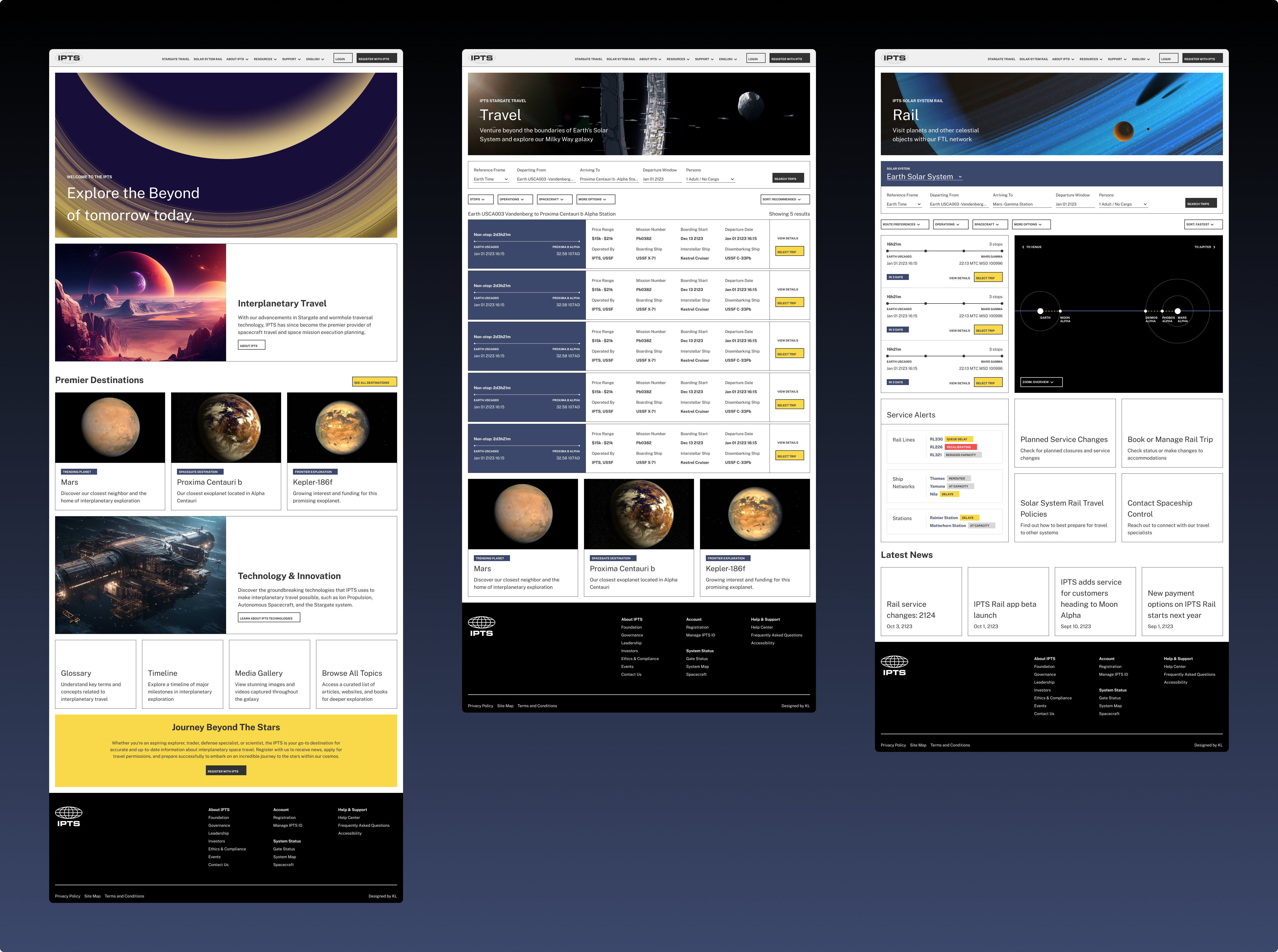
Identifying Components and Patterns
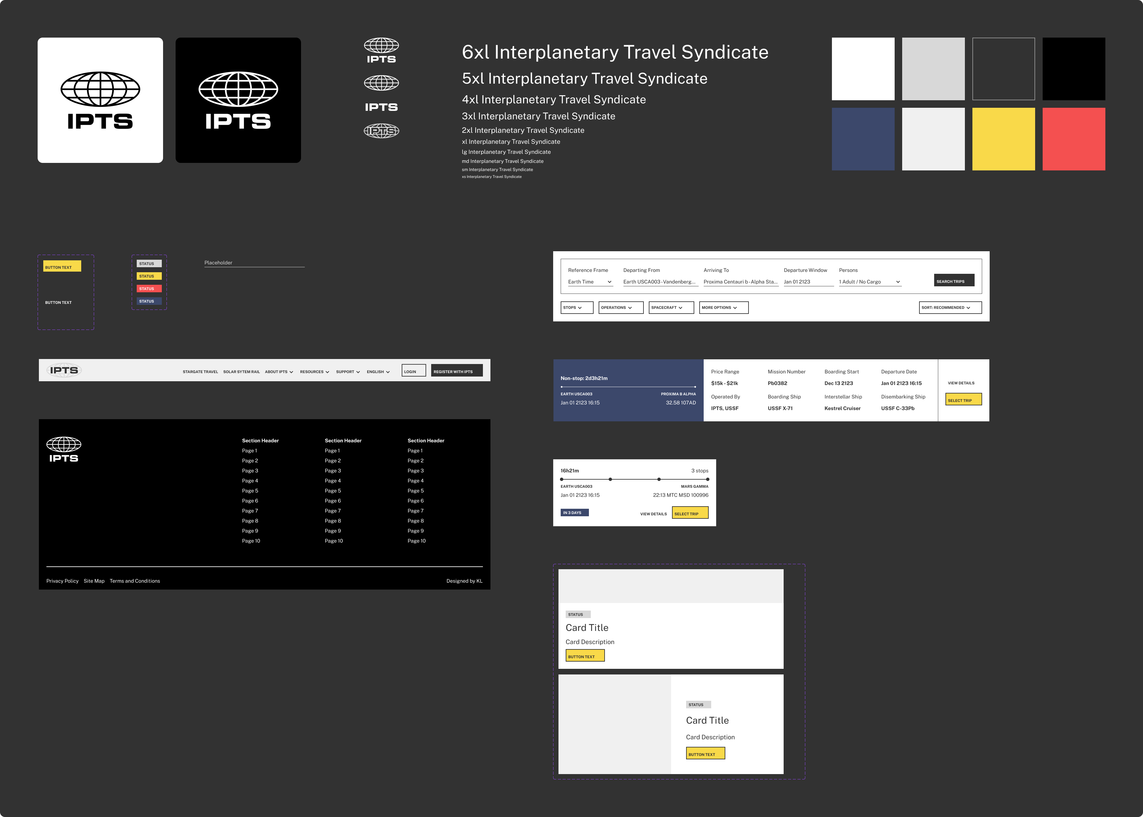
During the process of creating these screens, shared elements like buttons, inputs, and cards were collected and made into Figma components, which were the first steps in creating composable and reusable UI elements. As wireframing and UI creation continued, more elements like common colors, type sizes, and larger patterns were also componentized.
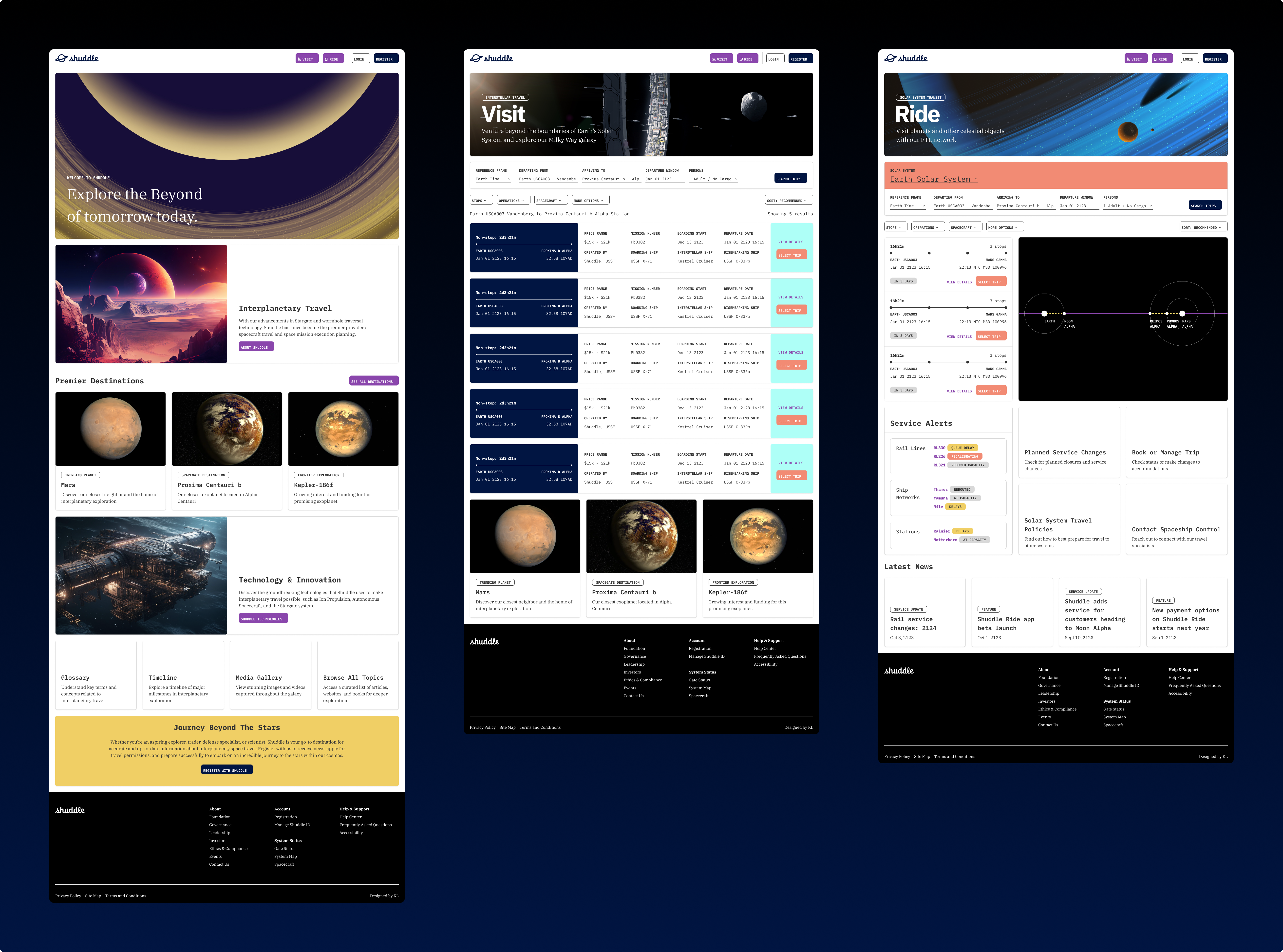
Delivering the Shuddle Rebrand
When it came time to re-envision the IPTS pages as Shuddle, care was taken to audit what patterns to keep and which to remake. A decision was made to not completely rework most of the existing framework, and to keep the scale of the Shuddle rebrand targeted and functionally similar.
Most UI components were duplicated and updated at the foundational level, to both preserve the compatibility of the legacy product, as well as to allow new Shuddle components to leverage existing logic, and grow separate from the old IPTS components if needed.
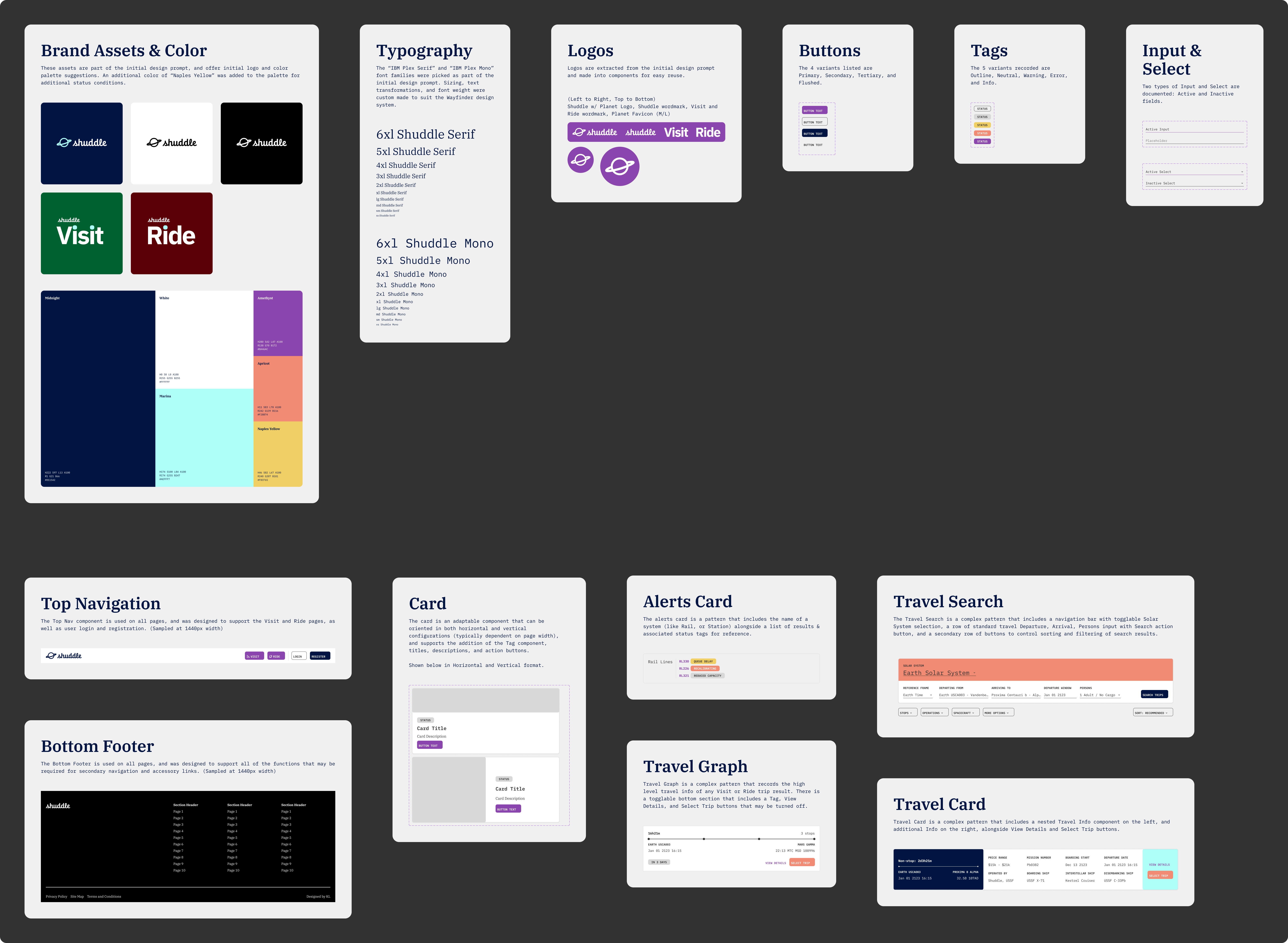
The new 🎨 Shuddle Figma designs were then created by selectively replacing the IPTS components with the new Shuddle variant in-place. Through leveraging the power of components and tokens, the update could be completed quickly with accurate results and built-in adherence to the new brand guidelines.
Collaboration & Delivery
Creating Shuddle in Code
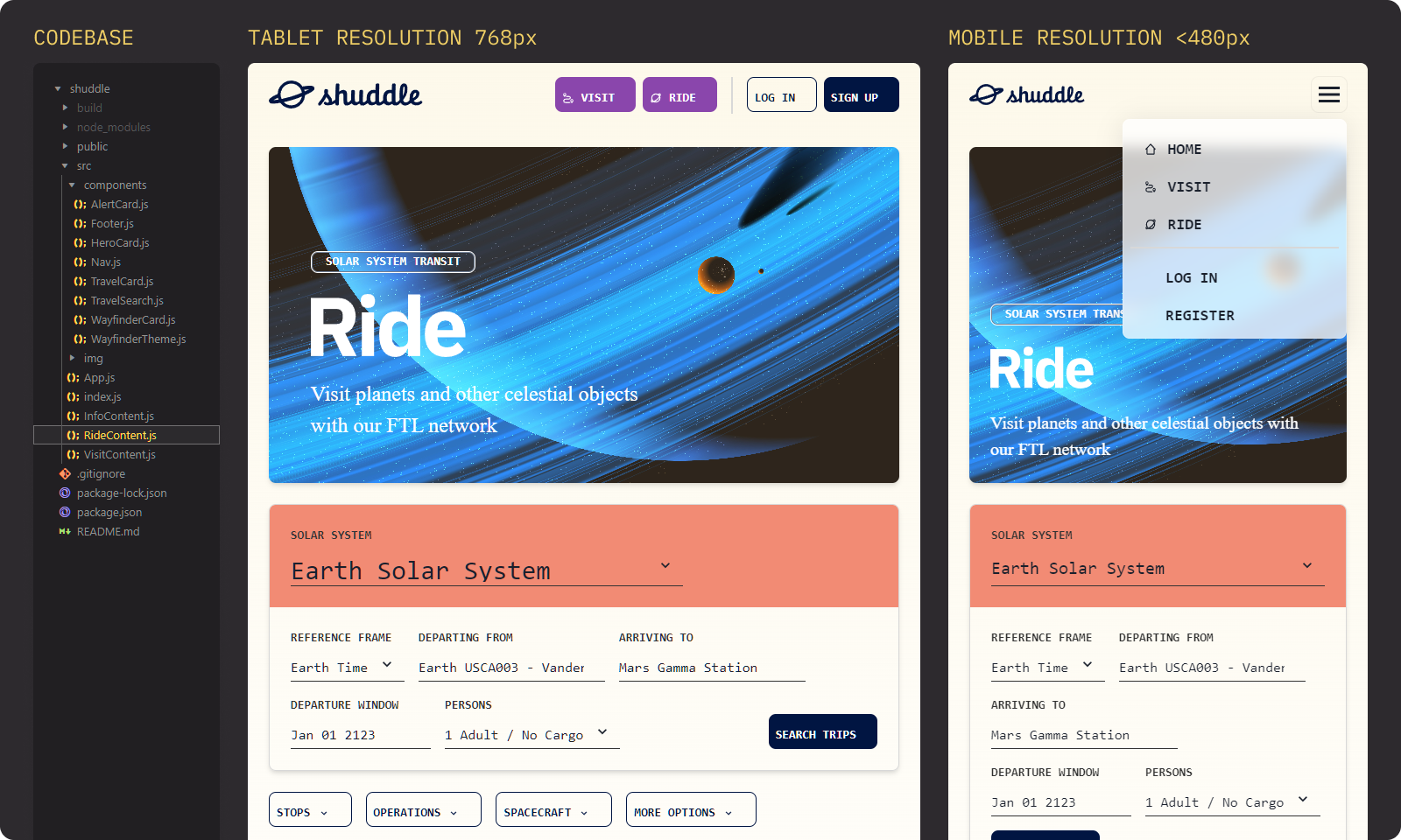
The Shuddle rebrand exercise also provided the opportunity to learn how such a design exercise would translate to code, and how collaboration and scalable deliveries can be achieved. I was able to do this by building a React app that utilizes an existing open source framework like Chakra UI. This choice was made in order to leverage a fast way to scale existing design components into composable code.
Deployment and Packaging
These code elements were then used to recreate the Shuddle app pages in a live demo build, and also gave me the opportunity to design & code responsive tablet and mobile versions in addition to the standard desktop design. This build and the source code was deployed on GitHub/GitHub Pages, which you can view here:
🚀 View Shuddle app demo
After the live demo was built and uploaded to GitHub, the components were then compiled with Babel and distributed as an ⚙️ deployable package on npm, with additional source code also deployed to another GitHub repository.
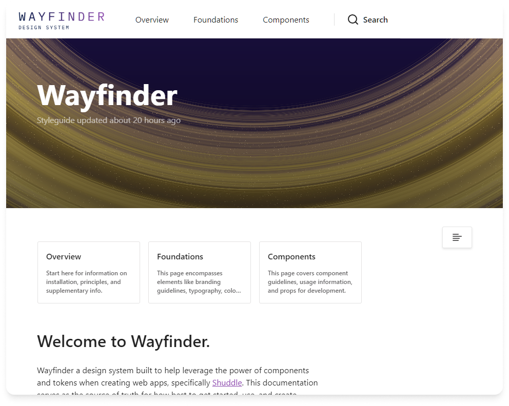
Documentation
📖 Documentation for Wayfinder was created in Zeroheight, and serves as the single source of truth for how best to install, learn, and use the elements created for this project. Sections were created for foundational tokens like brand colours, typography, and general use guidelines, as well as for simple and more complex component elements and patterns that were used in the Shuddle app.
Key Takeaways
Some lessons learned, and a few key takeaways of building and deploying Wayfinder include:
- The cyclical “measuring spoon” flywheel of reincorporating components from new products back into the design system library holds a lot of potential of reinforcing consistent and high quality systems if utilized correctly. This applies to both design and code, and often in-between during collaboration.
- Documentation is a design system in itself and a microcosm of the larger system as a whole. There were many times where I needed to rewrite sections of pages or reorganize the information architecture as a whole as the design system grew, or started encompassing more code snippets.
- Setting up the foundational elements and infrastructure to collect and deploy all of the composable token or components may take some effort and require multiple hats, but the end result takes much less time to reuse and scale into the future.
That being said, designing a system that encompasses UX, UI, code, and beyond that can scale has been an absolute delight. Its many moving parts demand both bespoke specificity and easily replicable production, and it is quite a thing to behold when it works.