Background
Designed as part of Brainstation’s UX Design course, this project aims to utilize heurstics to increase Amazon Subcribe & Save conversions, as well as present a redesign of their services on Android devices.
Role
UX Designer, Team of 3
Tools
Figma, Adobe Illustrator, Adobe Photoshop
Project Timeframe
2 weeks
Project context and scope
Amazon aims to be Earth’s most customer centric company by striving to continually raise the bar of the customer experience to help consumers find, discover and buy anything.
Subscribe & Save allows users to conveniently automate their regular purchases while receiving discounts for multiple orders. On the other hand, subscriptions provides predictable, recurring revenue for Amazon by leveraging their purchasing power for consumable goods.
Enhancing Subscribe & Save
By addressing usability pain points in the purchase flow user interface and information architecture, we can look to test the changes and validate if the improvements can generate positive user sentiment and emotion over time.
There are many opportunities to improve the user experience by addressing these existing usability issues. Ultimately, we predict it will lead to increased subscription rates and higher recurring revenue.
Assessing Usability
What is a heuristic evaluation?
An evaluation is the process for auditing a digital experience and assessing its usability quantitatively. By using the general framework of the 10 principles of UI design from Nielsen Normal Group, we can utilize a standardized rule of thumb to provide clear areas of improvement. The goal is to spot areas needing improvement so that we can enhance the overall user experience.
The 10 usability heuristics for UI design include:
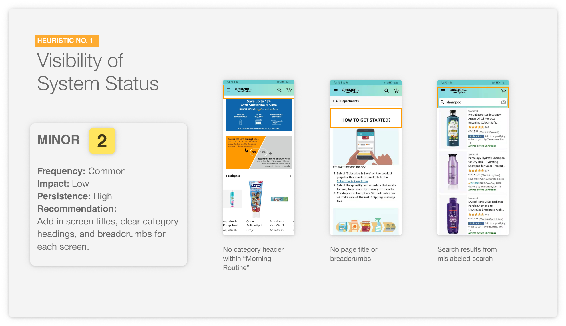
- Visibility of system status
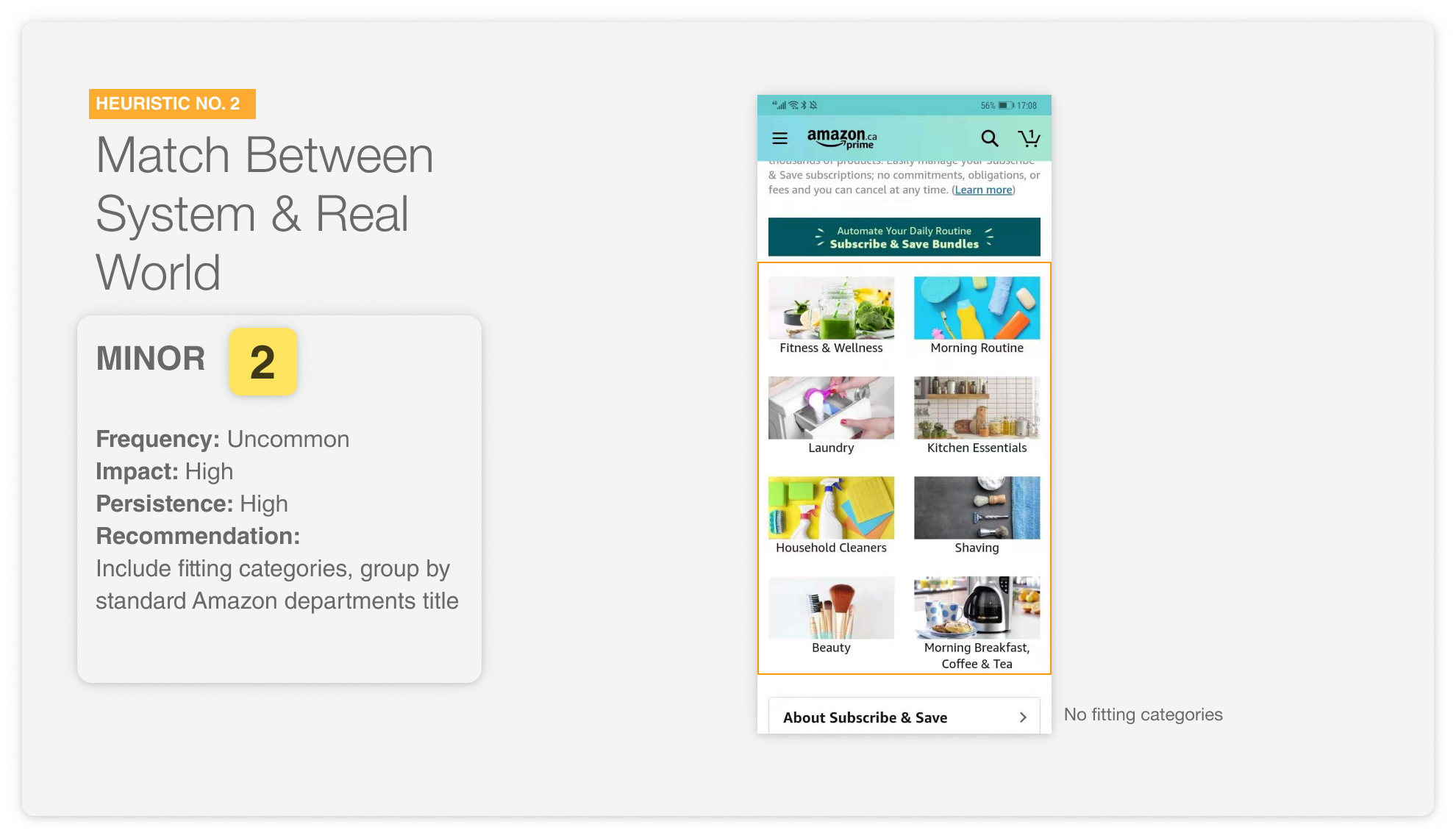
- Match between system and the real world
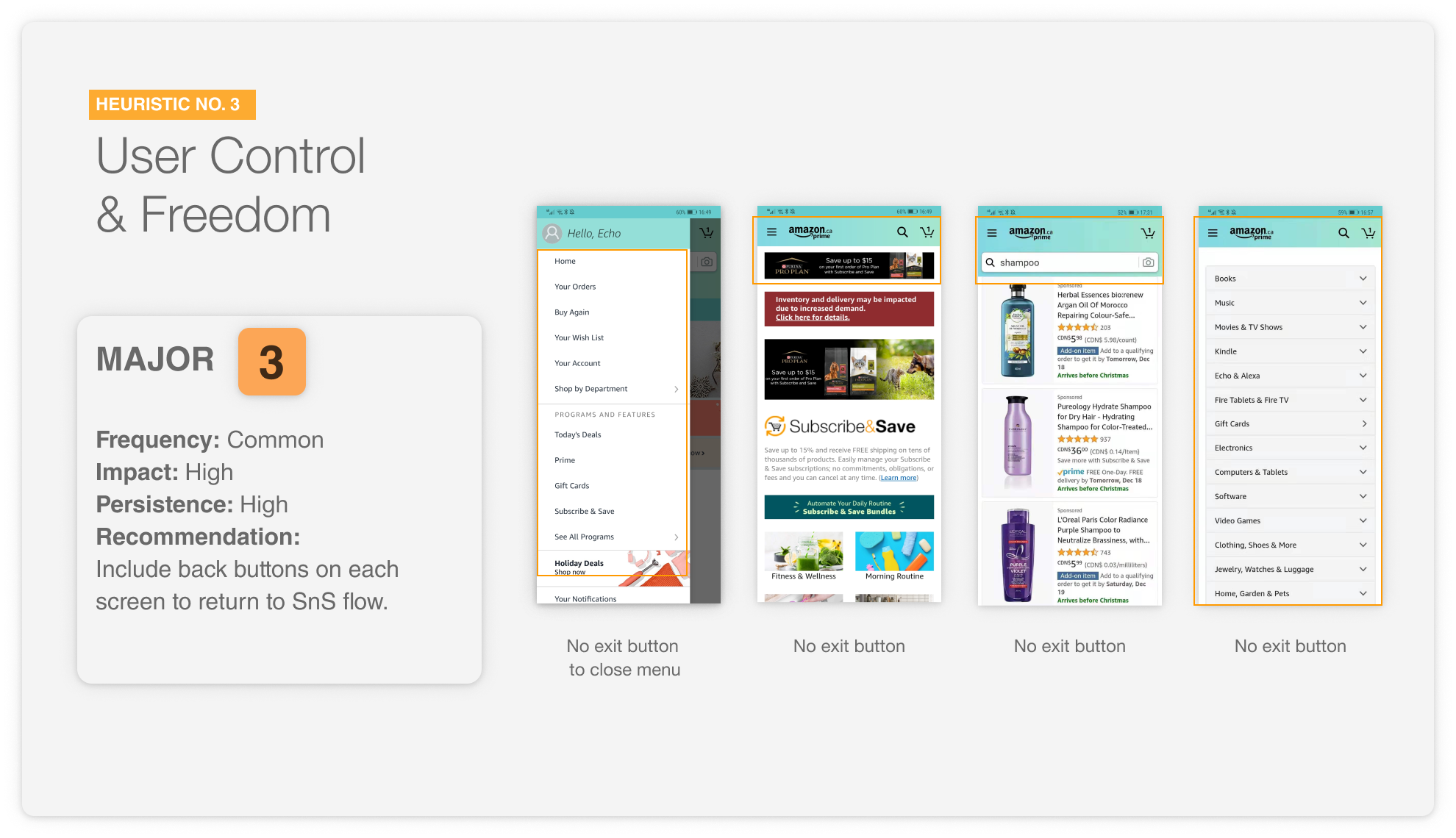
- User control and freedom
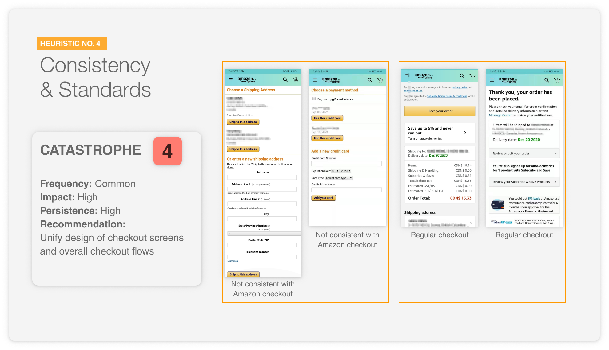
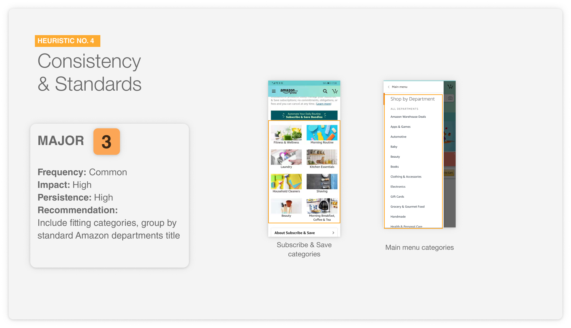
- Consistency and standards
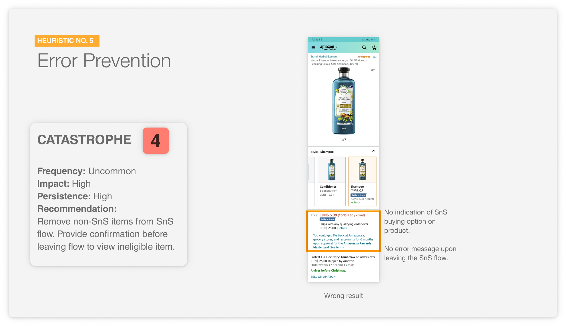
- Error prevention
- Recognition rather than recall
- Flexibility and efficiency of use
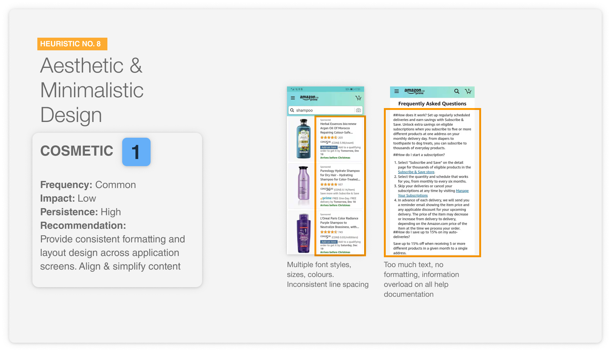
- Aesthetic and minimalist design
- Help users recognize, diagnose and recover from errors
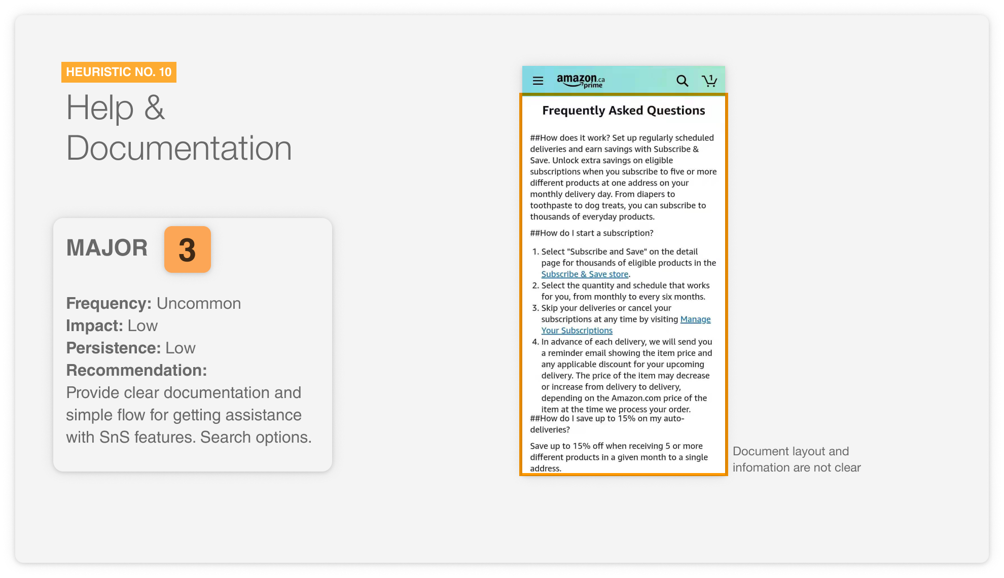
- Help and documentation
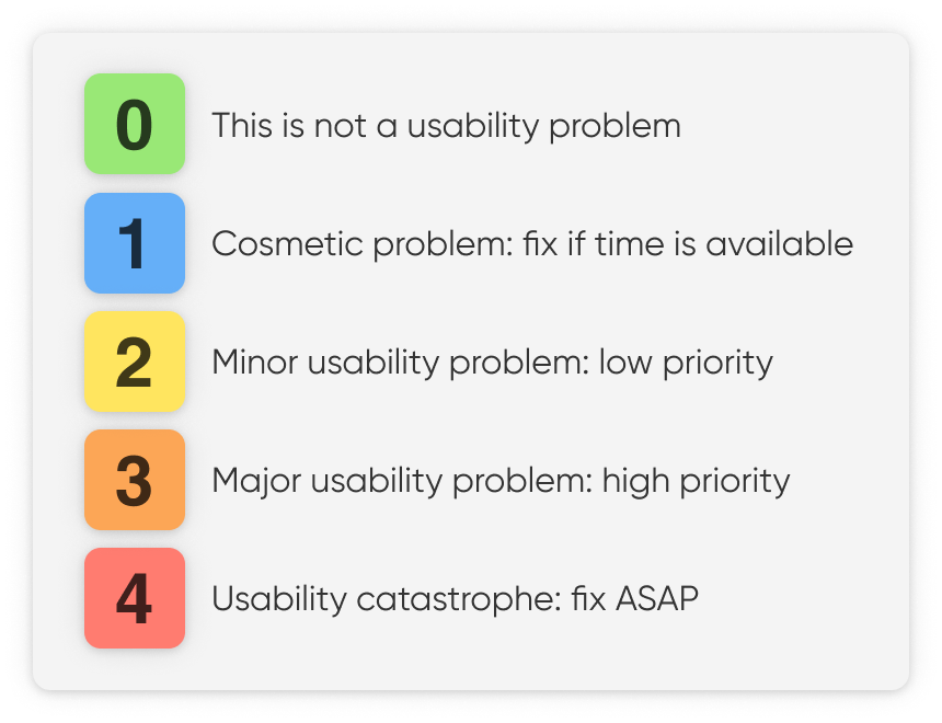
Severity ratings
We assess any violations in the design by giving it a score rating on a scale from 0 to 4. These scores are provided based on three key factors of the violation. At the end, we also provide an average rating to assess the overall market impact of these ratings.
- Frequency – is the problem common or rare?
- Impact – is it easy to overcome the problem?
- Persistance – will the problem repeatedly be an issue?
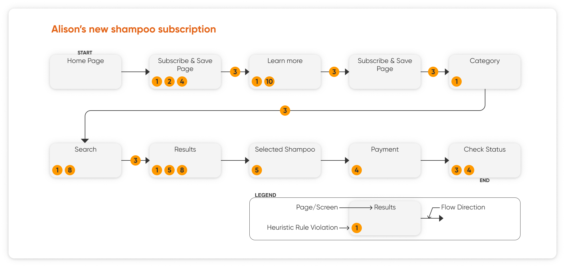
User flow overview
The flow chart here shows the pages tested for our heuristic evalution. The test scenario begins with our proto-persona, Alison, subscribing to a new shampoo subscription on the Amazon app for Android. The pages track which screens she goes on to make this subscription, as well as the heuristic violation that is experienced on each page.
7/10
Violations were found for the Subscribe & Save user flow, detailed below.
Heuristic Evaluation
Rating
We chose to give the Subscribe & Save flow on Android mobile devices a score of 2.75/5, based on the weighted average of the severity ratings given.
For a one-page executive summary of the issues and recommendations presented above, please click on the link below to view the PDF.
Proposed Redesign
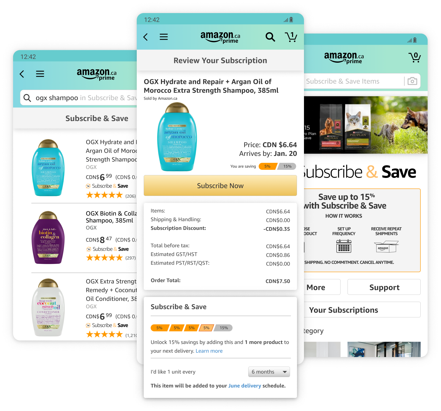
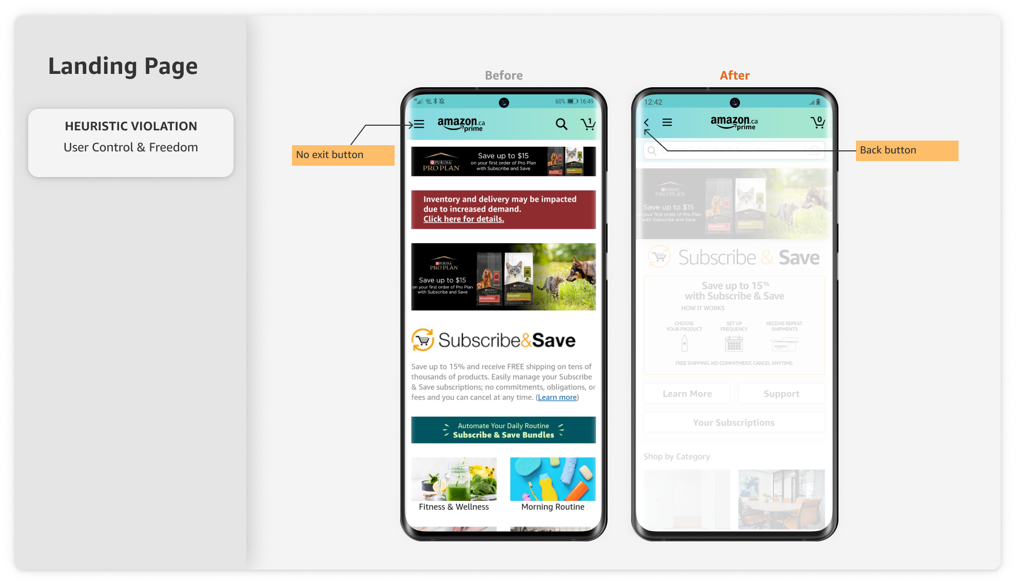
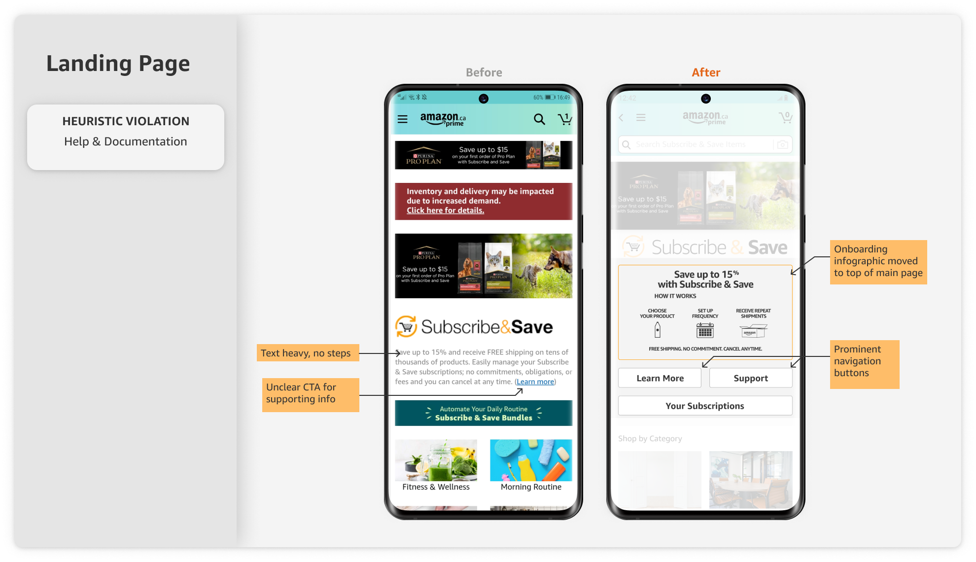
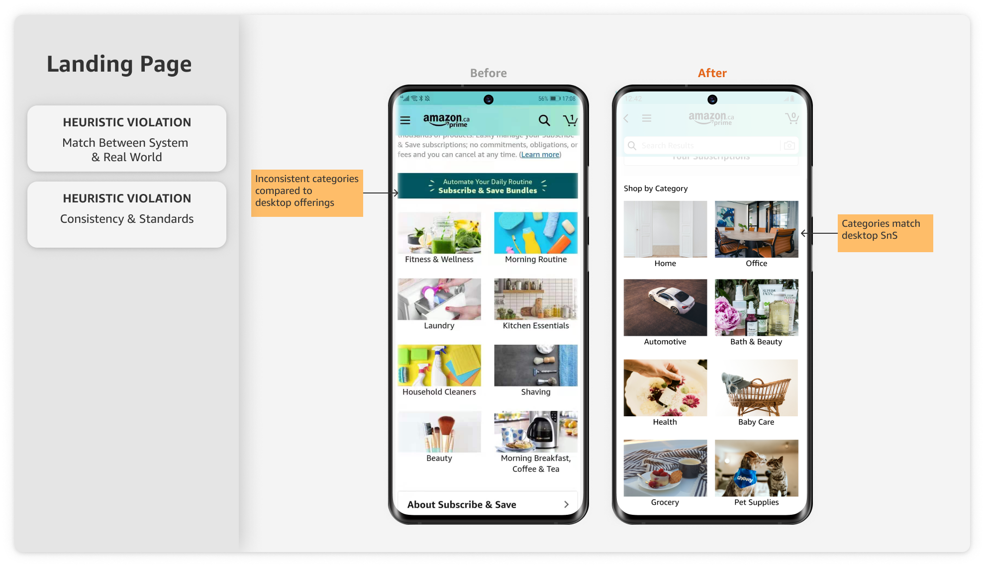
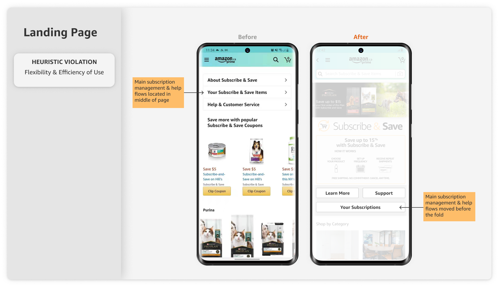
Front Landing Page
The landing page for Subscribe & Save, along with the top navigation bar was reinvisioned to include a few improvements discovered through the heuristic evaluation:
- Inclusion of a back button on the top navigation bar
- Moving the onboarding infographic to the top of main page
- Moving the subscription management and help flows to the top of main page
- Updated Subscribe & Save categories so they are consistent across desktop and mobile
Support Pages & Sidebar Menu
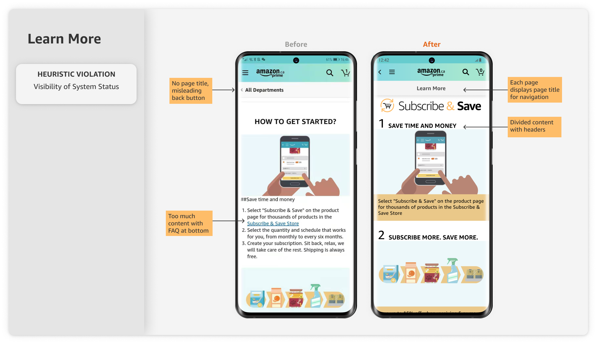
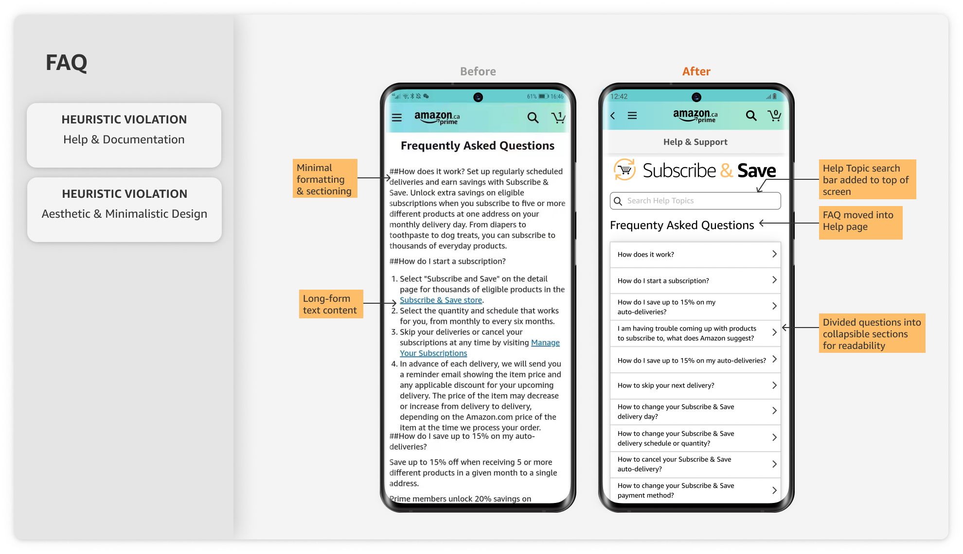
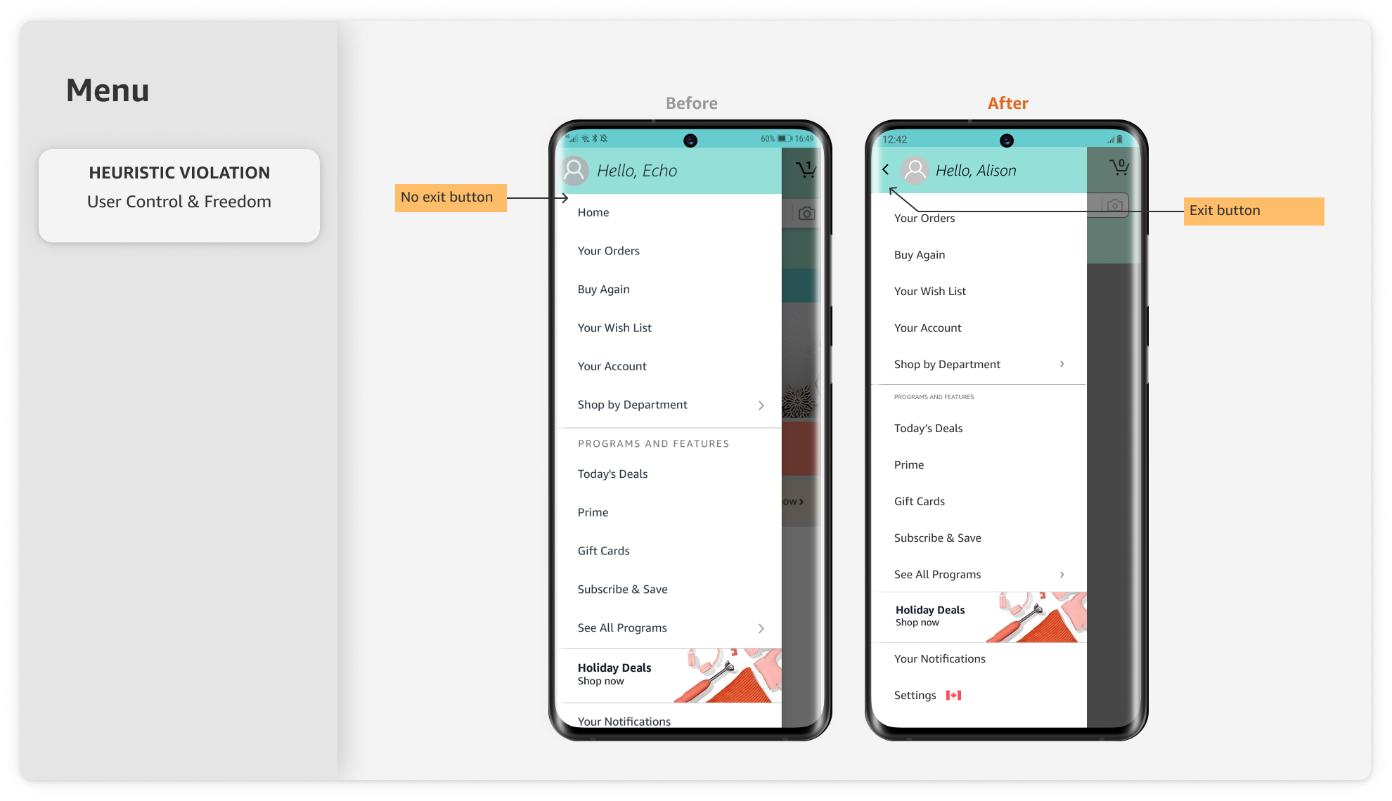
Next, we updated the Learn More, FAQ, and side menu screens:
- Included a local navigation title bar on each page for navigating within subcategory pages
- Updated and reformatted the Learn More & FAQ pages to ensure ease of use and clearer documentation
- Included the back button within the sidebar menu
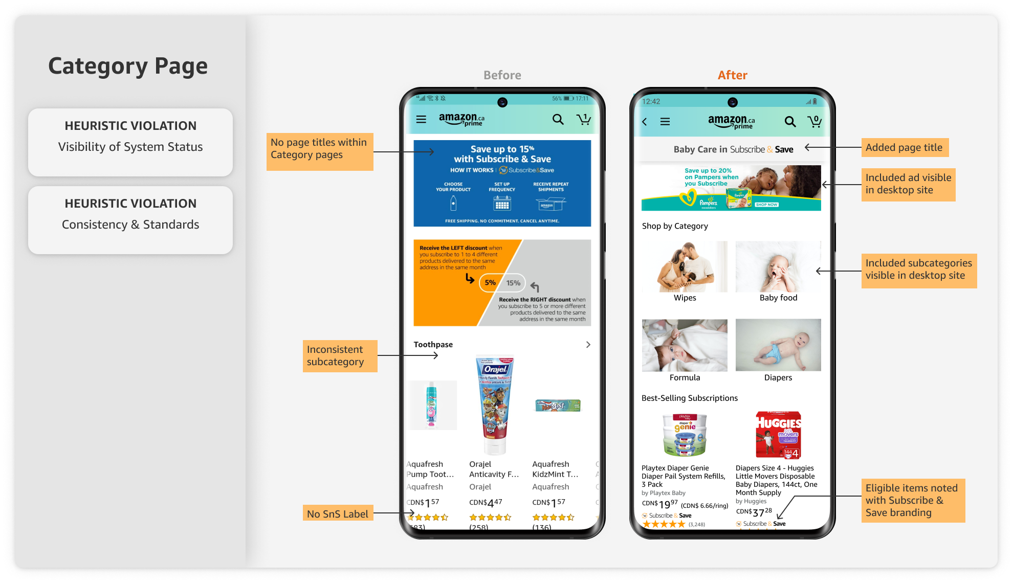
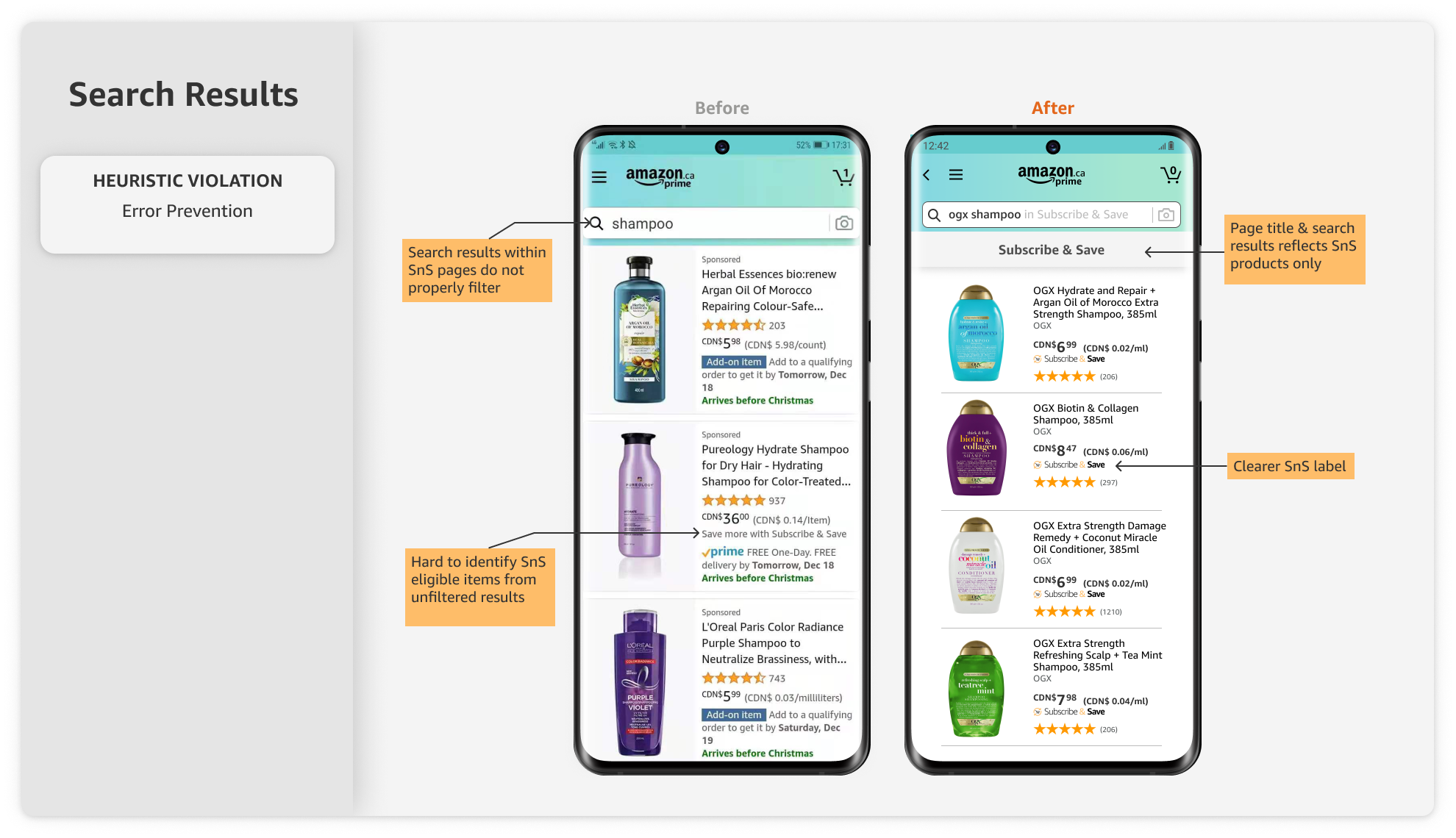
Category Pages & Search Results
For the product category and search pages, we aimed to make the results more consistent in formatting, and clearly indicate Subscribe and Save items:
- Included local navigation title bar
- Provided consistent Subscribe &Save branding in product listing information
- Moved the onboarding infographic away from product category page to main page
- Updated product categories so they are consistent between desktop and mobile
- Properly filter and display search topic for Subscribe & Save eligible items in the search bar
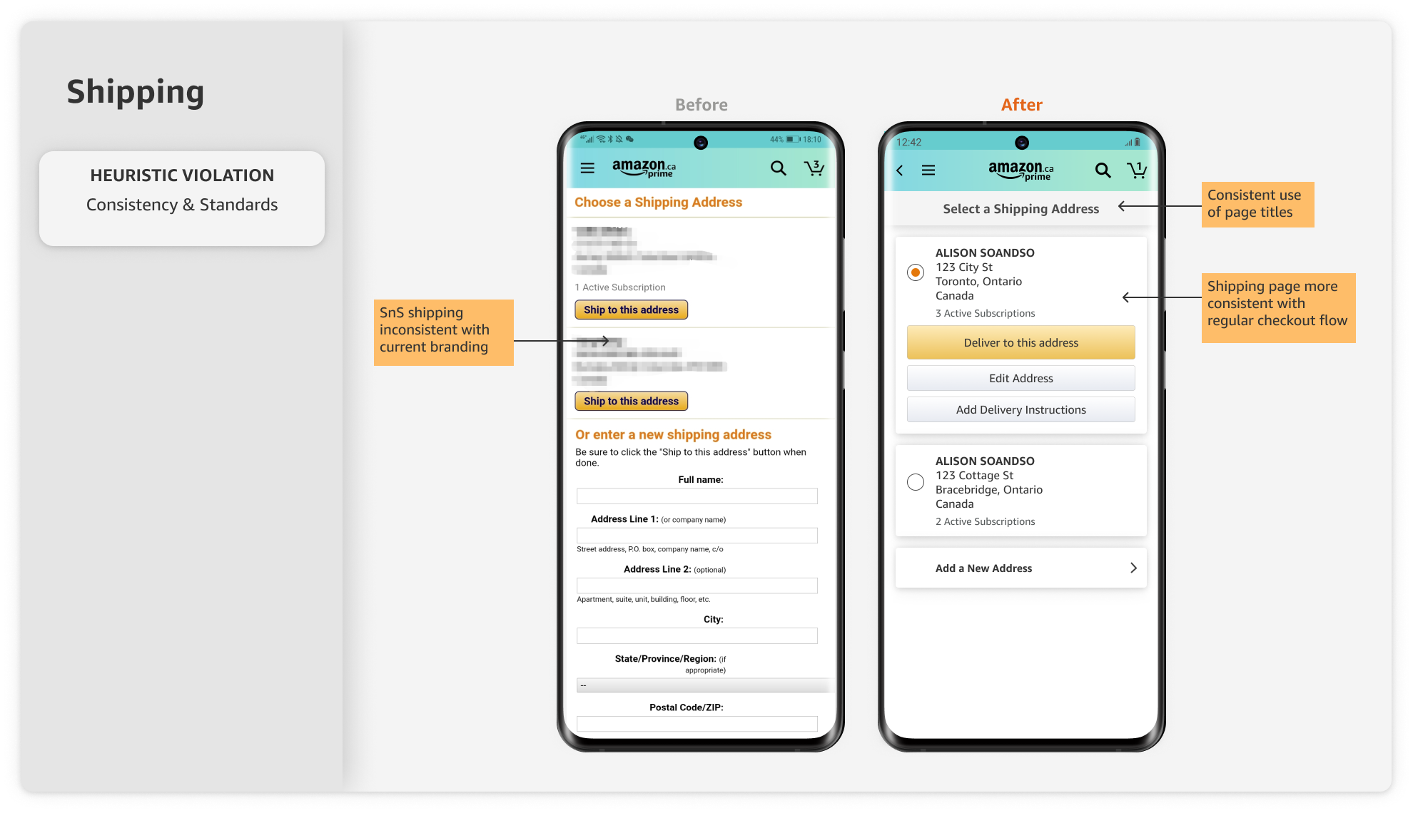
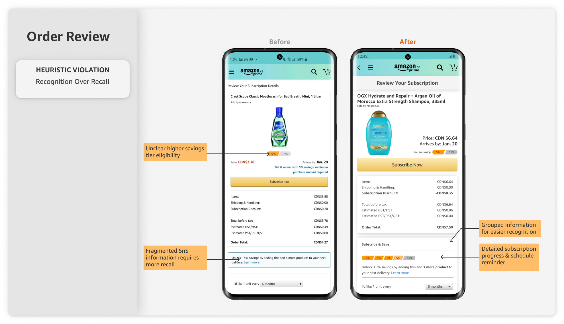
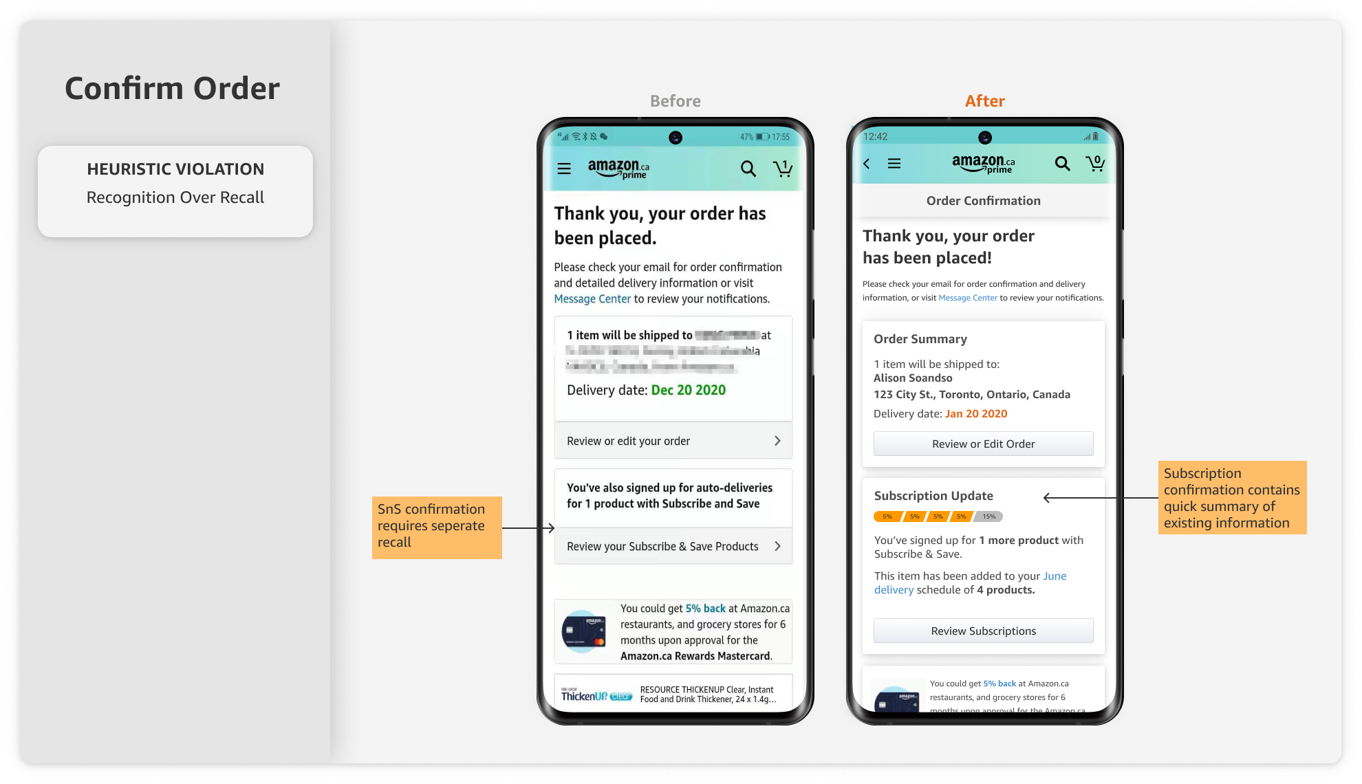
Shipping, Review, and Order Confirmation
There is a significant opportunity to improve the shipping and checkout portions the Subscribe & Save flow:
- Shipping information for Subscribe & Save was reformatted to be consistent with other Amazon shipping screens
- Consistent local navigation and page titles are provided on each screen
- A new card providing more information on the customer’s current subscriptions was included to decrease recalling previous orders
- A tiered savings graphic element was added to provide more context for customers’ saving level
- A simple and minimalist card design was implemented across the shipping, review, and confirmation screens
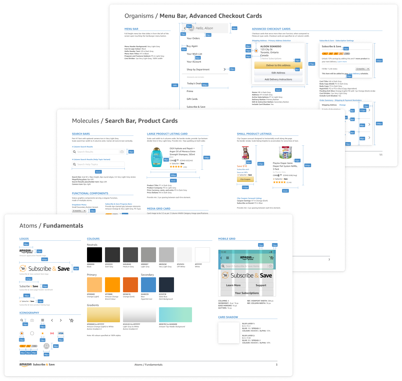
UI Library & Design System
Design documentation
The Atomic Design Methodology by Brad Frost was used as the general classification guideline to document the design system used for the Subscribe & Save redesign.
Click on the button below to view the entire UI library & design system documentation as a PDF file.