
Background
Designed as part of Brainstation’s UX Design course, Routene examines What could happen to transportation if we gave city commuters the power to link together transportation options in the palm of their hands. How would transit change with the continued growth of our digital lives?
Role
UX Designer – Solo project
Project Timeframe
2.5 months
Tools
Figma, Sketch, Adobe Photoshop, Adobe Illustrator, InVision

Commuting can be a real drag.
The problem of long commutes in a metropolitan area may be as unavoidable as it is ubiquitous, & can negatively affect a traveller’s life satisfaction, stress levels, and free time.
The goal of this project seeks to decrease the pain points commuters within a city may experience, such as reducing long travel times, stressful driving scenarios, or the negative emotional impact of commuting.
Defining the problem space.
The next step was to focus on how to refine the broad scope of commuting to something manageable and measureable. Specifically, the average commute time and cost were examined as possible avenues for intervention.
With some early secondary research of how much commuting can suck (answer: quite a bit), the initial focus was created and refined as a How Might We statement, that can being to give direction to solving our commuting woes
16 million
Canadians commuted to work in 2016.
20 minutes
of extra commute time has same negative effect as a 19% pay cut.
84 minutes
Average commute time a day in Toronto (2019), up 8% over 6 yrs.
$400+
A month of average commuting cost.
How might we…
Help individuals commuting in cities better plan their trip in order to reduce cost and stress while travelling?
Research Insights
5 commuters were interviewed to provide insights on:
- Commuting patterns and habits
- Travel costs and planning
- Comfort
- Previous experiences with commuting
The goal of the research is to obtain qualitative data on how users commute to and within a metropolitan area, as well as to validate the secondary research collected above.
This qualitative data obtained will help serve as the basis for the development of Personas that can be used to represent the user in all further product development.
For the in-depth research methodology, criteria, interview questions, and summary, please click on the button below for more information.
Research Summary
After conducting 5 interviews with commuters who use car, public transit, walking, or a combination of these modes, a few overall themes were identified from the qualitative data. These findings were first arranged per person, and then by pain points, motivations, and behaviours.
The goal of this summary is to filter the data of the findings into a relevant persona and reasonable project scope.


Success Metrics
Constraints and limitations aside, it is still feasible to place indicators within the project framework to gauge valuable key performance indicators that we can use to assess the potential of the idea. A few indicators are listed below:
- Shortened average commute times or shorter wait times between transit.
- Decreased overall commuting frequency and duration for users of the application.
- Decreased cognitive load for commuters planning their path of travel.
- Increase in happiness of users commuting with the app.
Project Assumptions
Here are a few assumptions made for the project that provide framework for our mental model.
- User needs can be solved by scheduling travel across multiple means of transportation
- Users can regain lost time or cost using this app
- Partnerships with transit agencies and/or premium service options are possible
Project Constraints
Every project will face certain constraints and limitations, whether it be technological, business-related, or social cultural. There is also the constraint that Routene was developed in 8 weeks within an educational context, so any proprietary R&D is off the table, unfortuantely.
Technological:
- Size, speed, and features of motor vehicles, trains, bikes, busses
- Existing road infrastructure within the metropolitan area
- Existing transit networks within the metropolitan area
- Integrations or connections between existing transport services, if any.
Business:
- Heavy investment from car manufacturers for automated self-driving cars
- Large competition from map & navigation software makers
- Limitations of collaborating between government & transporation entities
- Routine investment in infrastructure upgrades
Social-cultural:
- Division of marginalized groups by geographic location
- Under-representation of certain demographic groups in infrastructure development
- Inherently non-inclusive transporation options
- Cost and availability of transportation options
Design Opportunities
Providing value to commuters
From the interview findings, 6 themes were identified as opportunities to start designing a possible intervention. Out of these 6 broad themes, the list was then shortened to 3 themes as key areas of interest.
Due to the wide range of variability in city layouts and infrastructural constraints, commute distance was not considered a viable theme for this exercise. However, distance are definitely factored into the application as a variable of multi-modal transit.
Alternative Transit Options
What is the benefit of having a single option vs having multiple commuting options?
Balancing Costs
What the monetary value is of repeated travel vs the length of travel time? What about for special exceptions?
Competive Analysis
A non-exhaustive list of common applications & services used in the North American market for commuting was made. We will be taking a closer look at Uber and Google Maps, as they are a couple of the largest applications by user downloads.
One opportunity for intervention identified here is for a tool that goes beyond just pointing out starting and ending destinations, but can accept multi-modal ways of transport within. Driving to a transit hub, or using transit to get to the nearest bike-share could leverage the benefits of both modes of transportation, while minimizing the time or costs of both.

Creating User Personas
Based on the research and interviews conducted, two personas were developed to represent two seperate archetypes of a typical commuter. A different mode of transportation was given to each persona to better reflect the range of commuting experiences available.


Mapping out the experience
The experience map for Cameron was created to offer a more granular look at the particular journey a driver would have as they undertake their commute. As such, Cameron’s typical drive has been mapped out to document any prevalent pain point(s) of driving.

Task Prioritization
User Stories
Written from the perspective of our persona Cameron, multiple user stories were created to document how he could interact with an application in a way that would satisfy his goals. These user stories were then grouped under an overarching epic as a means to classify the information.
Overall, the overarching epic of Navigation was chosen, as the stories within are very centrally addressing many of the woes Cameron may have on his typical journey.

User Flows
The following user stories were picked and refined to create the main task flow. These stories were deemed mandatory to the functionality of the application.
- As a commuter, I want to know what multi-modal transit options are available to me, so that I can evaluate the options I have for travel.
- As a commuter, I want to be able to estimate my trip cost, so I can better gauge the total trip costs over time.
- As a driver, I want to be able to see live traffic and accident updates on my route, so that I can adjust my route accordingly.

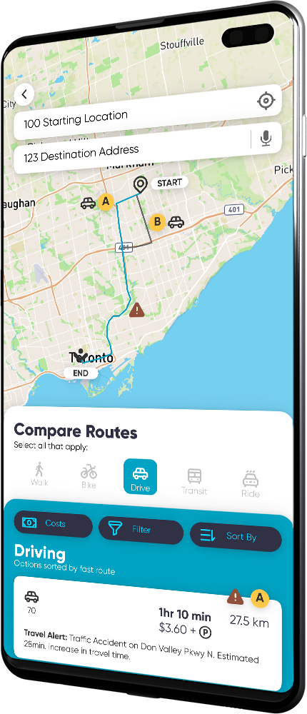
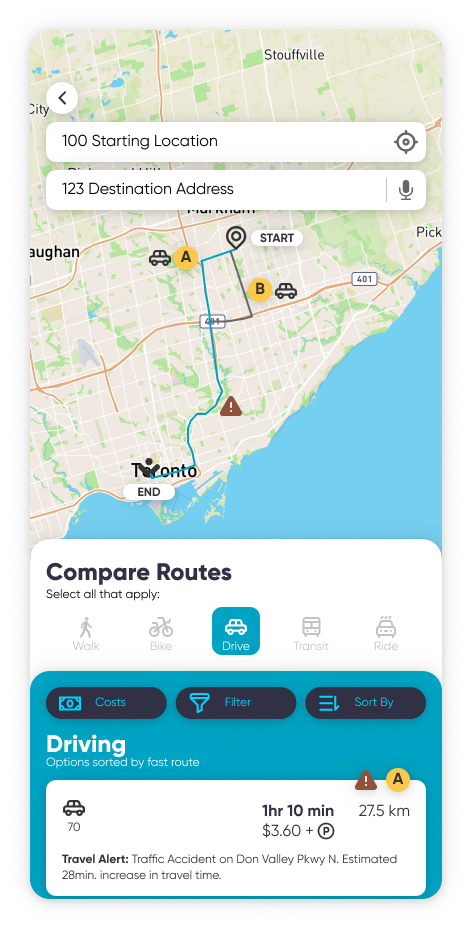
Visualizations & Prototyping
Initial Concept Sketches
An initial concept was developed for a mobile application that will satisfy the user flow.
In this scenario, Cameron can navigate to a location, check how much the car drive would cost him, see that there’s an accident along the way, and that informs him to choose to drive to the subway station instead.


User Testing & Refinement
10 testers over 2 rounds of testing were given tasks to complete to test usability and provide feedback for the design.
After concept sketches were completed, further refinement to the visual design and User Interface was spearheaded through several rounds of user testing and feedback. This approach kept the design as user-focused as possible, and provided a rationale for any design changes and revisions.
A brief summary of the usability testing questions are shown below, and helped take the design from Version 1 (low-fi digital prototype) through to Versions 2 & 3 (mid-fi prototype), and eventually, Version 4 (high-fi prototype).

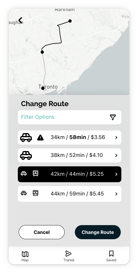
Refinement: Route Selection
An example of how can we simplify the screen and route selection options based on user feedback.
Ordered from first to final version of the same screen.
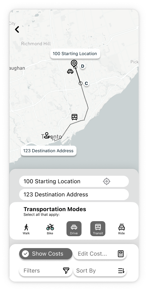
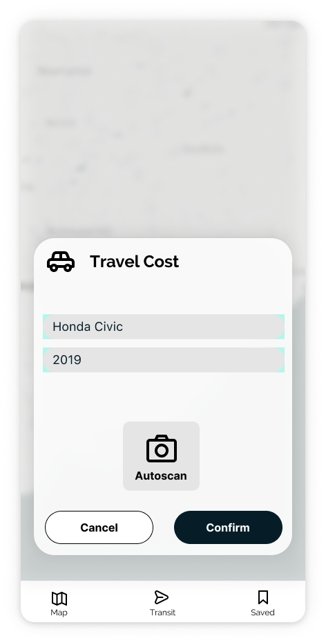
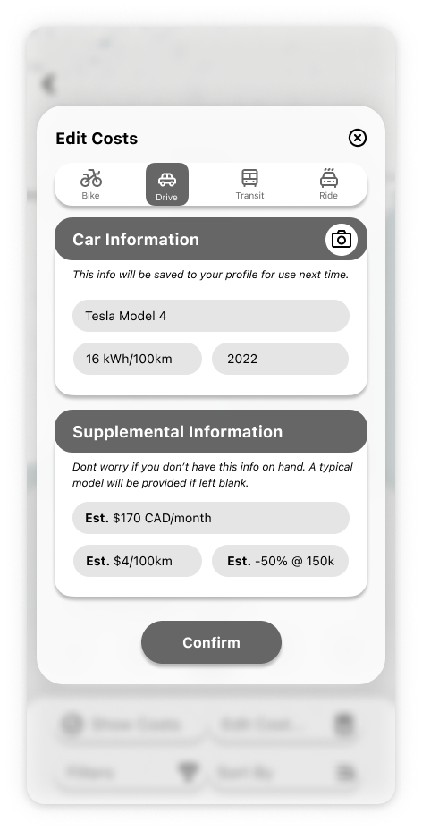
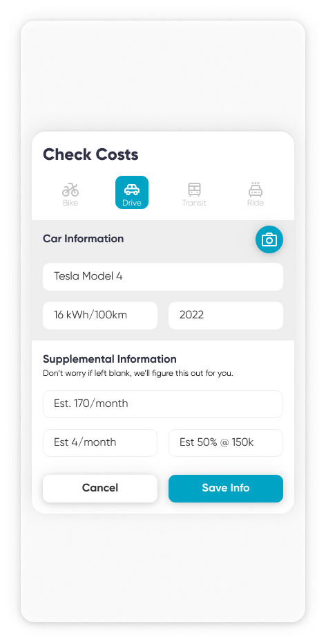
Refinement: Travel Cost Modal
An example of how can we increase the functionality of calculating costs based on user feedback.
Ordered from first to final version of the same screen.
Visual Identity
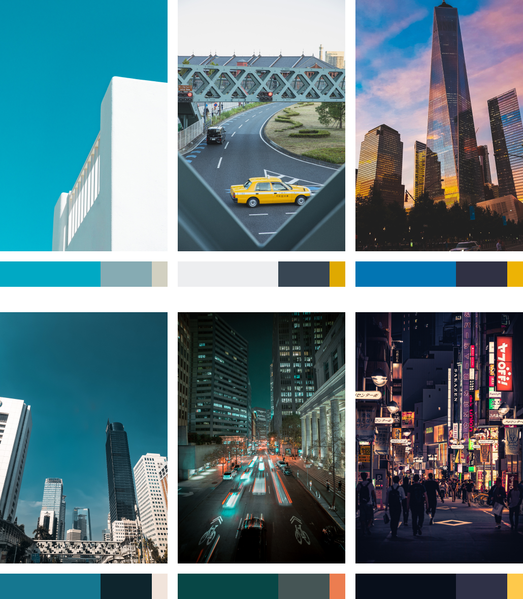
Style guide and moodboard
The approach taken to design the visual identity of Routene included first looking for inspirations for wordmark, logos, feel, typography, and colour palettes to capture the unique and modern style of the app.
Click on the links above to view the full InVision moodboard, and for more design rationale on the visual choices chosen for the app. The full UI library with all documented logos, colours, iconography, typography, and screen designs are also available.
Brand colours and typography
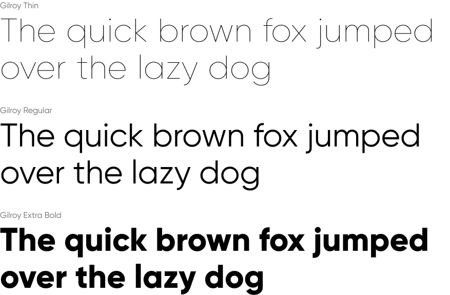
A dark blue, medium teal, and yellow were chosen as the primary brand colours. Lighter versions were also included as alternate variants for state changes or providing more visual contrast. A set of 6 neutral colours were also picked to provide contrast to the foundational UI elements.
The brand font used on all screens is Gilroy, a modern sans serif font with a geometric touch. The spacious kerning and clean, simple shapes help present the navigation information in the app in an unobtrusive and legible way.

Branding wordmark and app icon
Different sans serif geometric fonts were tested in different sizes, weights, spacings, and styles to look for the right feel for the brand. In the end, Objective Bold was picked to develop the wordmark further.
The second phase of brand development was done through testing out capitalizations and editing letterform curves to create a unique design. The final wordmark shape was determined with the assistance of peer testing & feedback.
The inspiration for the app/logo design came from incorporating elements of the period from the wordmark, and aimed to incorportate a symbol that denotes movement, such as an arrow or location pin.

Multiplatform Design
Integrating Routene into other digital mediums.
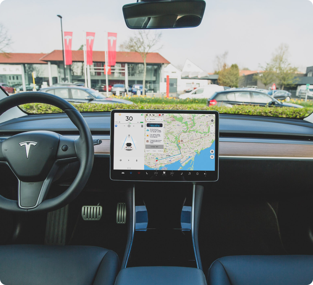
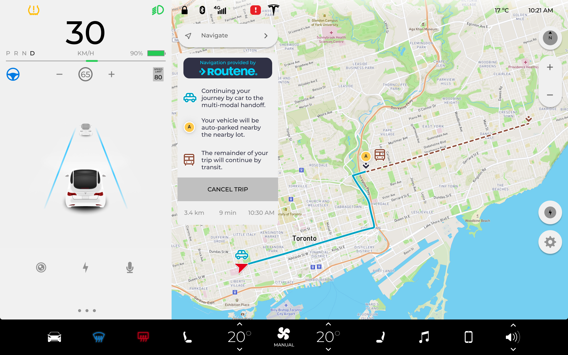
As an exploration of various other platforms the app can be used on, the interface was envisioned to be integrated within a car dashboard. While Google Auto and Apple CarPlay in their current forms serve as great analogues of a mobile screen, a Tesla Model 3interface was chosen, due to it’s discrete nature that operates seperately from a phone.
In the example flow below, a user like Cameron has used Routene to start a navigation route from their phone that requires driving. Upon confirmation, the app will send directions to the Tesla, from which Cameron can seamlessly continue his journey without having to take out his phone and repeat the navigation on the car dashboard.
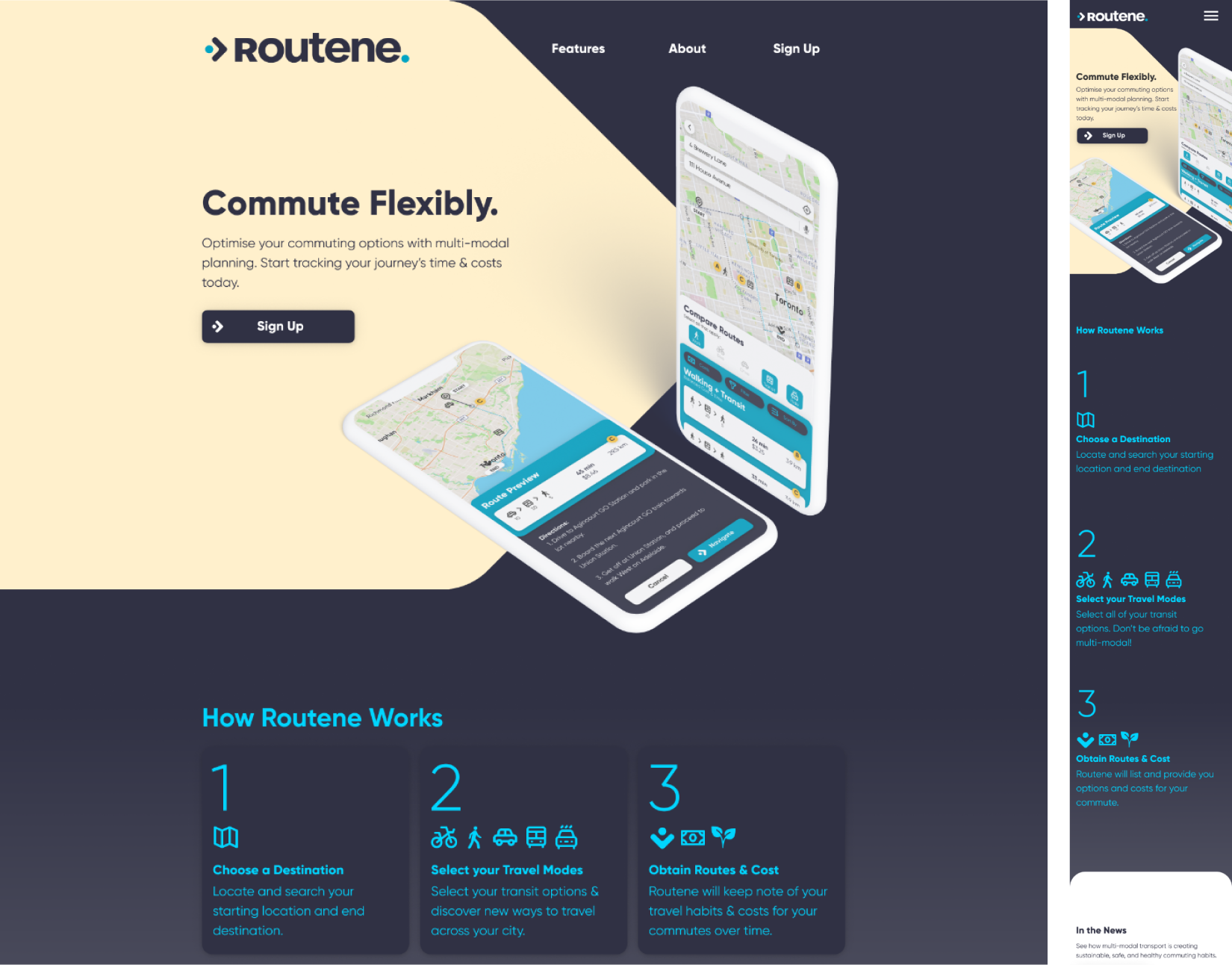
Marketing Site
Branding Routene for web and mobile.
A hypothetical marketing website was developed to promote the Routene app and its features. Similar to the mobile prototype design, ideation was taken from low fidelity wireframes to high fidelity through several iterations and rounds of user feedback.
The desktop website was developed with a 12-column, 1180px max width system, while the mobile website was developed with a 4-column 16px margin and gutter, at variable width.
Click on the links above to view the full marketing website prototype, as well as the InVision moodboard curated for the marketing website design.
Design Impact & Next Steps
Creating a sustainable, multi-modal future
What might the future hold for multi-modal transit? While doing the initial primary and secondary research for the development of the app, environmental impact was not the primary focus affecting how people choose transit options today. However, over the course of developing this project, it seems that environmental sustainability and deploying multi-modal commuting options in interconnected cities are an overall boon towards good transit practices, and seem like a perfect match.
We could see decreases in CO2 emissions from passsengers choosing to drive less distance to reach a destination, using more electric vehicles, switching to public transit, walking, or biking as alternatives. These alternate modes of transportation besides driving a gas-powered vehicle could also profoundly improve health through physical activity and social connection. Having an app like Routene that could leverage this change seems like a human-centered and forward thinking approach.
Changing transportation
On the personal vehicle level, multi-modal integration with autonomous cars or ride-hailing services could be great complementary services. As we look towards having vehicles with self-parking or self-delivery capabilities, it is reasonable to assume a passenger can more easily switch to another transportation method to continue a trip, without worrying about their personal vehicle.
At the scale of commercial shipping & freight logistics, the advent of having trucks or delivery vehicles that can load, unload, and continue the shipping journey across multiple vehicles with little human intervention seems like a great boon in shipping productivity.
At the scale of road infrastructure, it could be possible that the promotion of multi-modal transport can affect city planning profoundly. We may see increases in pedestrian-only areas of the city, more efficient and automated parking lots that do not need to be directly next to services.
Key learnings
The most important key learning I’ve had working on this project is to trust the process of designing for the user, and not yourself. The final output of the design was not something I would have come up with or design in a vacuum, and looks quite a bit different from the untested design solutions I assumed would be designed in my mind. That being said, I quite like the outcomes that have arose from the users interviewed & feedback I have recieved.
Another key learning is to never stop learning! Even in the hours before this project was made live, I was still finding big a-ha! moments and insights that have the potential to completely change aspects of the project. Likewise, the Routene project feels like a living document that should be revised and tweaked as new technologies develop, new feedback comes in, or new user needs are born.
In terms of next steps, a good starting point is to explore further into the health and sustainability context of multi-modal transportation. How can we give health-concious users the ability to select and add more walking routes to their trips? Could there be integration with fitness apps for a portion of the trip? On the other hand, could we give drivers who use public transit metrics on how much CO2 emissions were avoided by taking public transit?
There’s a lot of possible directions for taking the project further, and I’m excited what the multi-modal future of commuting looks like.
Appendix & Attribution
Research References:
https://www150.statcan.gc.ca/n1/pub/75-006-x/2019001/article/00002-eng.htm
https://www.inc.com/business-insider/study-reveals-commute-time-impacts-job-satisfaction.html
https://www.geotab.com/press-release/americas-best-commuter-cities/
https://www.washingtonpost.com/transportation/2018/09/17/american-commutes-keep-getting-longer-according-survey-data-show/
Webpage Graphics:
Public City Transport Isometric drawings created by macrovector – www.freepik.com
Brand Inspiration Images / Creative Commons No Attribution / Pexels
Tesla Model 3 Dashboard / Creative Commons No Attribution / Unsplash